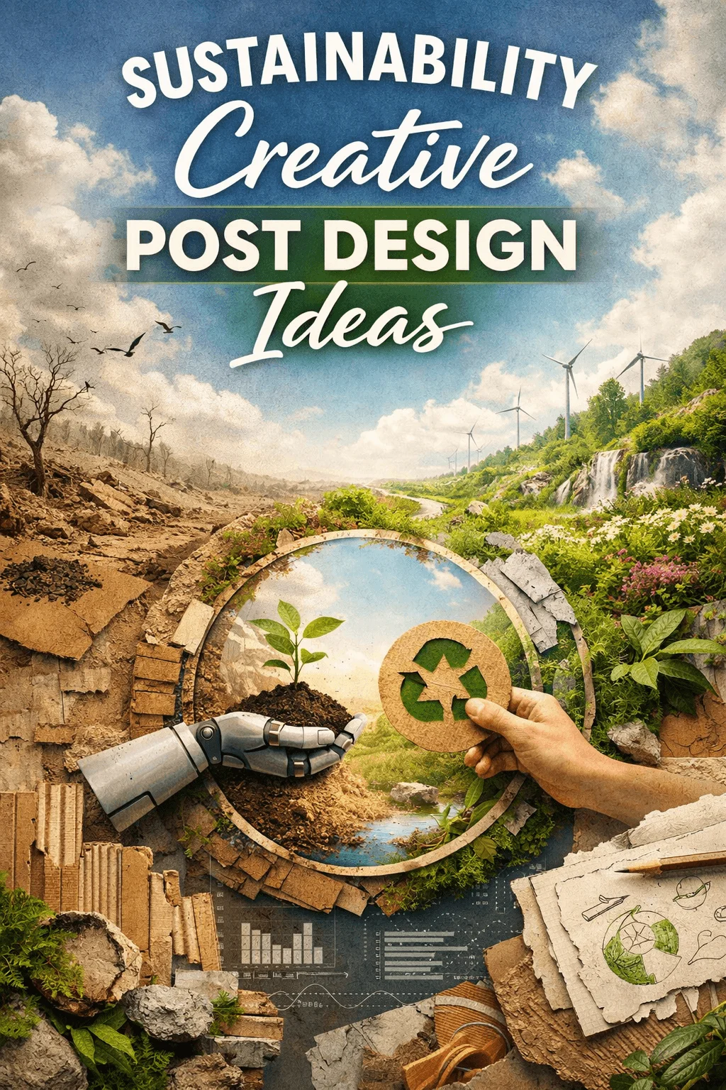
Modern Sustainability Brochure Cover Design Ideas
Sustainability has evolved from a supporting message into a defining force in modern design. In 2026, brochure cover design is no longer about simply looking eco friendly. It is about expressing values, building trust, and communicating a deeper commitment to environmental responsibility.
Audiences today are more aware and more critical. They can easily recognize when sustainability is being used as a surface level marketing tactic. Because of this, designers are shifting toward more meaningful and thoughtful approaches. A brochure cover is often the first interaction a viewer has with a brand’s sustainability message, which makes it a powerful opportunity to create emotional and intellectual impact.
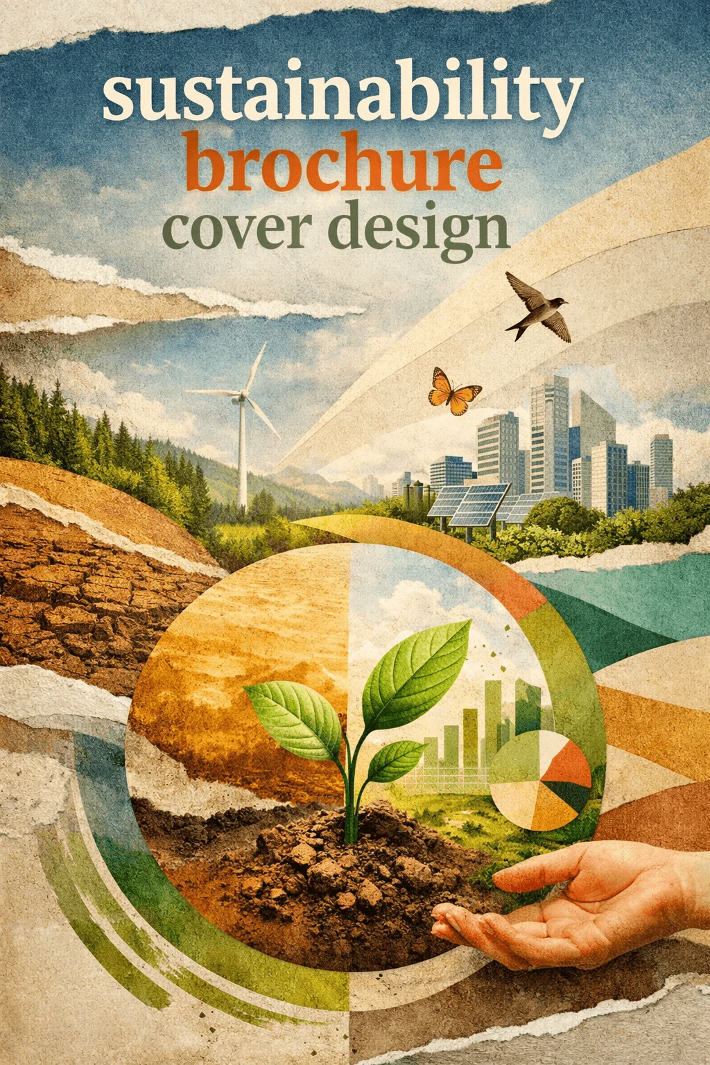
Modern sustainability brochure cover design ideas are now driven by storytelling, psychology, and innovation. The goal is not just to attract attention but to create a sense of authenticity and forward thinking vision. The following trends explore how this transformation is shaping design in 2026.
The Rise of Narrative Driven Cover Design
Sustainability is a story of change, and designers are increasingly using brochure covers to communicate that journey. Instead of presenting a static image, the cover becomes a narrative moment that hints at transformation, responsibility, and future goals.
This approach works because people connect more deeply with stories than with symbols. A visual that suggests movement from damage to restoration or from consumption to balance creates curiosity and emotional engagement. It allows the viewer to feel part of a larger purpose rather than just observing a message.
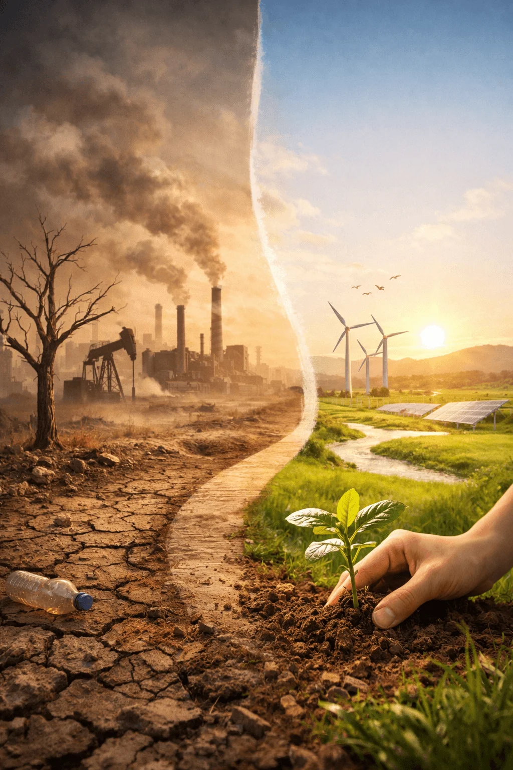
Designers are carefully choosing imagery, composition, and typography to guide the viewer’s interpretation. Even subtle visual cues can suggest a beginning, middle, and future outcome.
Organic Imperfection and Authentic Expression
One of the most noticeable shifts in eco friendly brochure cover design is the move away from perfection. Clean and polished layouts are being replaced with designs that feel more natural and human.
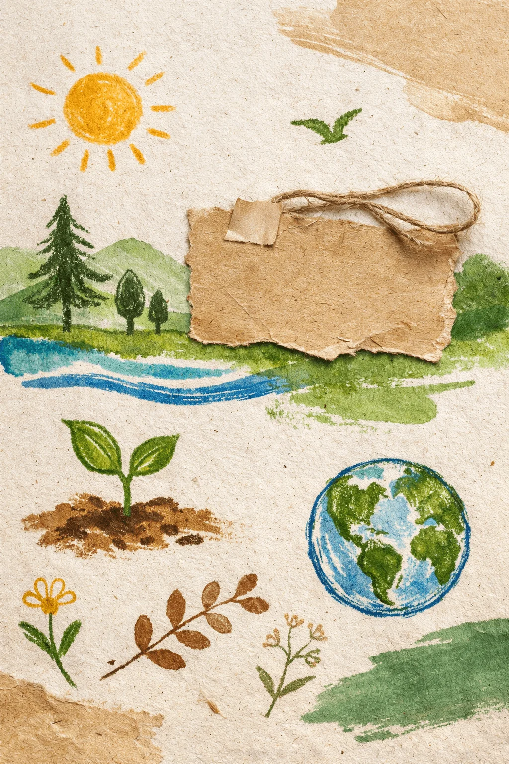
Organic style eco brochure cover concepts embrace irregular shapes, hand drawn lines, and uneven textures. These elements create a sense of authenticity because they resemble real world processes rather than digital perfection. Sustainability itself is not flawless, so the design reflects that honesty.
This approach also reduces the corporate feel that often makes sustainability communication seem distant. Instead, the design becomes more relatable and emotionally accessible.
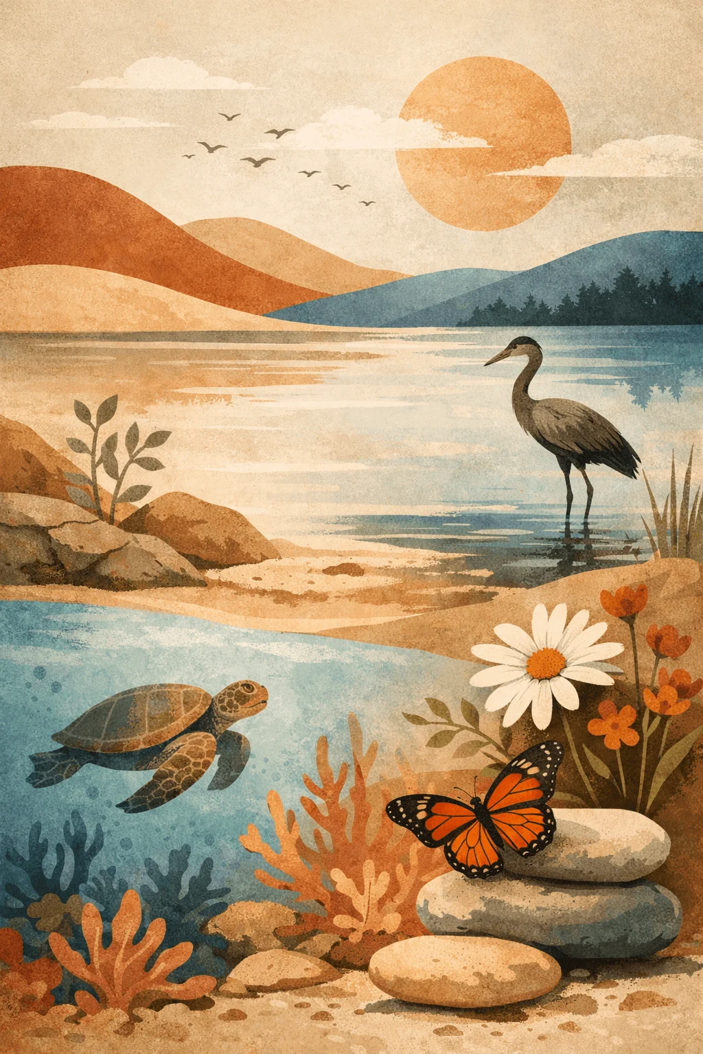
Moving Beyond Literal Nature Imagery
For years, sustainability design relied heavily on direct representations such as leaves and trees. While these elements are still recognizable, they are no longer enough to stand out.
In 2026, designers are interpreting nature in more abstract and conceptual ways. Shapes, gradients, and visual metaphors are used to suggest natural systems without showing them directly. This creates a more sophisticated and modern aesthetic.
Abstract representation allows for deeper creativity and avoids repetition. It also encourages viewers to think rather than simply recognize, which makes the design more engaging.
Expanding the Eco Color Language
Green will always be associated with sustainability, but relying only on it can make designs predictable. Modern sustainability brochure cover design 2026 explores a broader palette inspired by the natural world.
Earth tones such as clay, sand, and stone are combined with muted blues and subtle warm shades. These combinations create a richer and more balanced visual experience. They also reflect the diversity of ecosystems rather than focusing on a single aspect.
Color is being used not just for aesthetics but for emotional influence. Softer tones can create calmness and trust, while contrasting accents can draw attention and add energy.
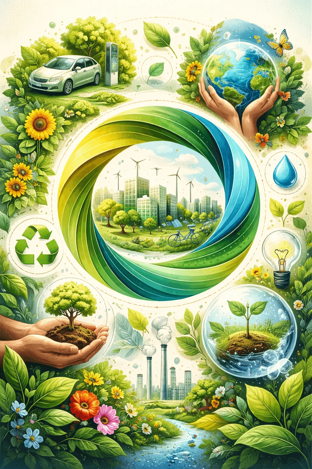
Layered Visual Storytelling Through Collage
Creative eco brochure cover layout ideas are increasingly using layered compositions to communicate complexity. Sustainability is not a single idea but a combination of environmental, social, and economic factors.
By layering images, textures, and typography, designers can represent multiple ideas at once. This creates depth and encourages viewers to explore the design more closely.
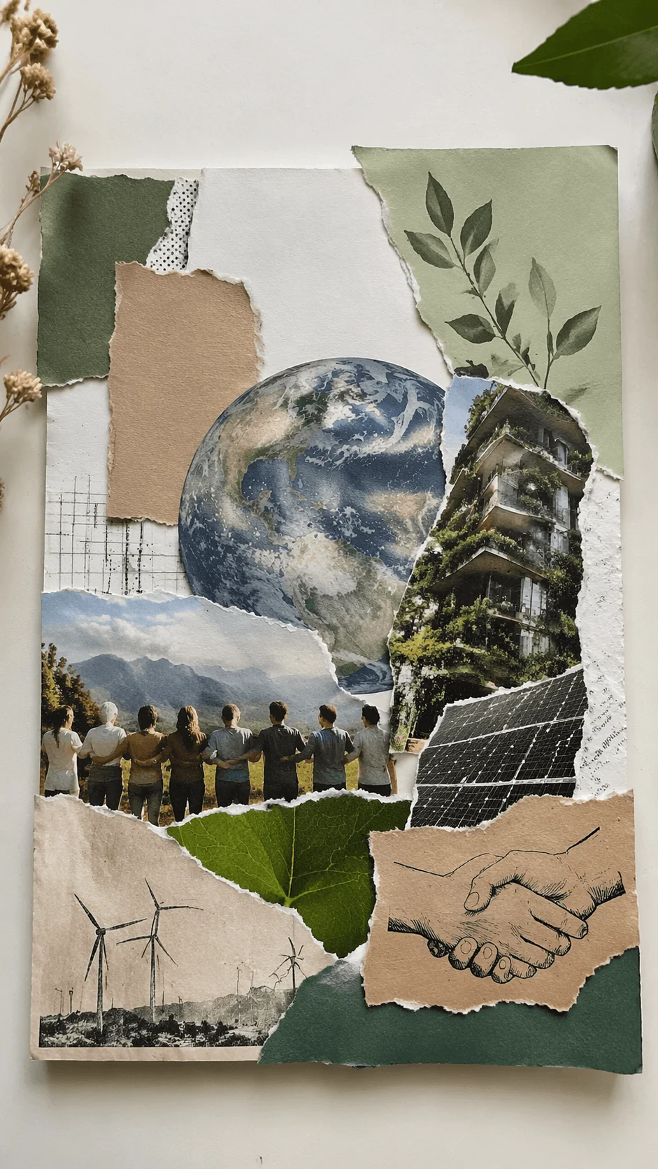
Collage style design also adds an artistic quality that makes the cover feel unique. It breaks away from rigid layouts and introduces a sense of exploration and creativity.
Circular Thinking as a Visual Concept
The idea of circular economy is influencing not only business strategies but also design language. Covers are being designed to reflect cycles, continuity, and regeneration.
This can be expressed through circular shapes, repeating patterns, or compositions that guide the eye in a loop. These visuals subtly reinforce the concept of sustainability as an ongoing process rather than a fixed goal.
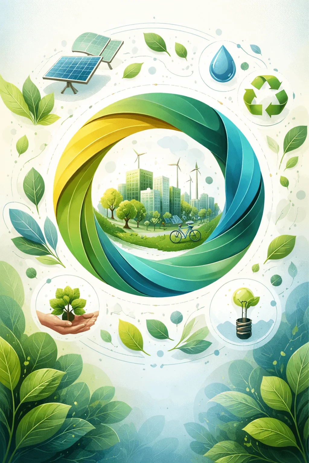
This approach aligns the visual design with the underlying message, creating consistency between form and meaning.
Typography as a Core Visual Element
Typography is becoming more central in green brochure cover design inspiration. Instead of supporting visuals, it often becomes the main focus.
Large, expressive type can communicate tone and emotion immediately. It allows the message to be clear without relying on additional imagery. This is particularly effective in digital contexts where simplicity improves readability.
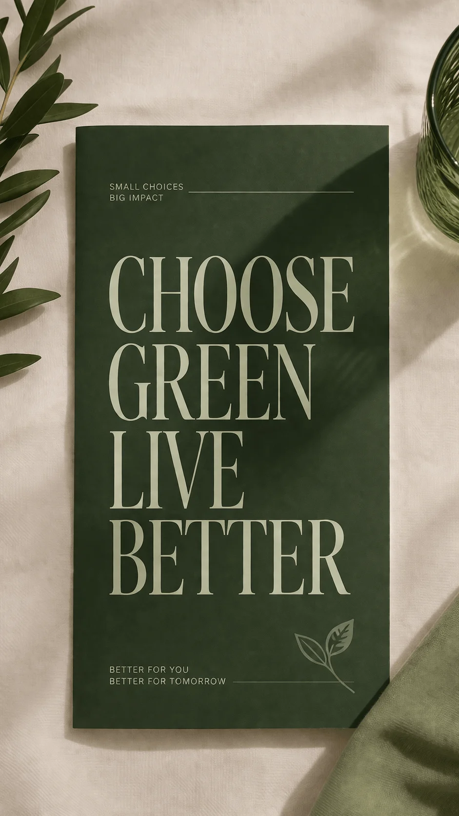
Designers are experimenting with font styles, spacing, and scale to create impact while maintaining clarity.
Sensory Design Through Texture and Material Influence
Textured sustainability brochure cover design is gaining importance as brands look for ways to create a more immersive experience. Even in digital formats, visual textures can suggest physical qualities.
Paper grain, fabric like patterns, and natural surfaces add depth and realism. These elements create a connection between the design and the materials associated with sustainability.
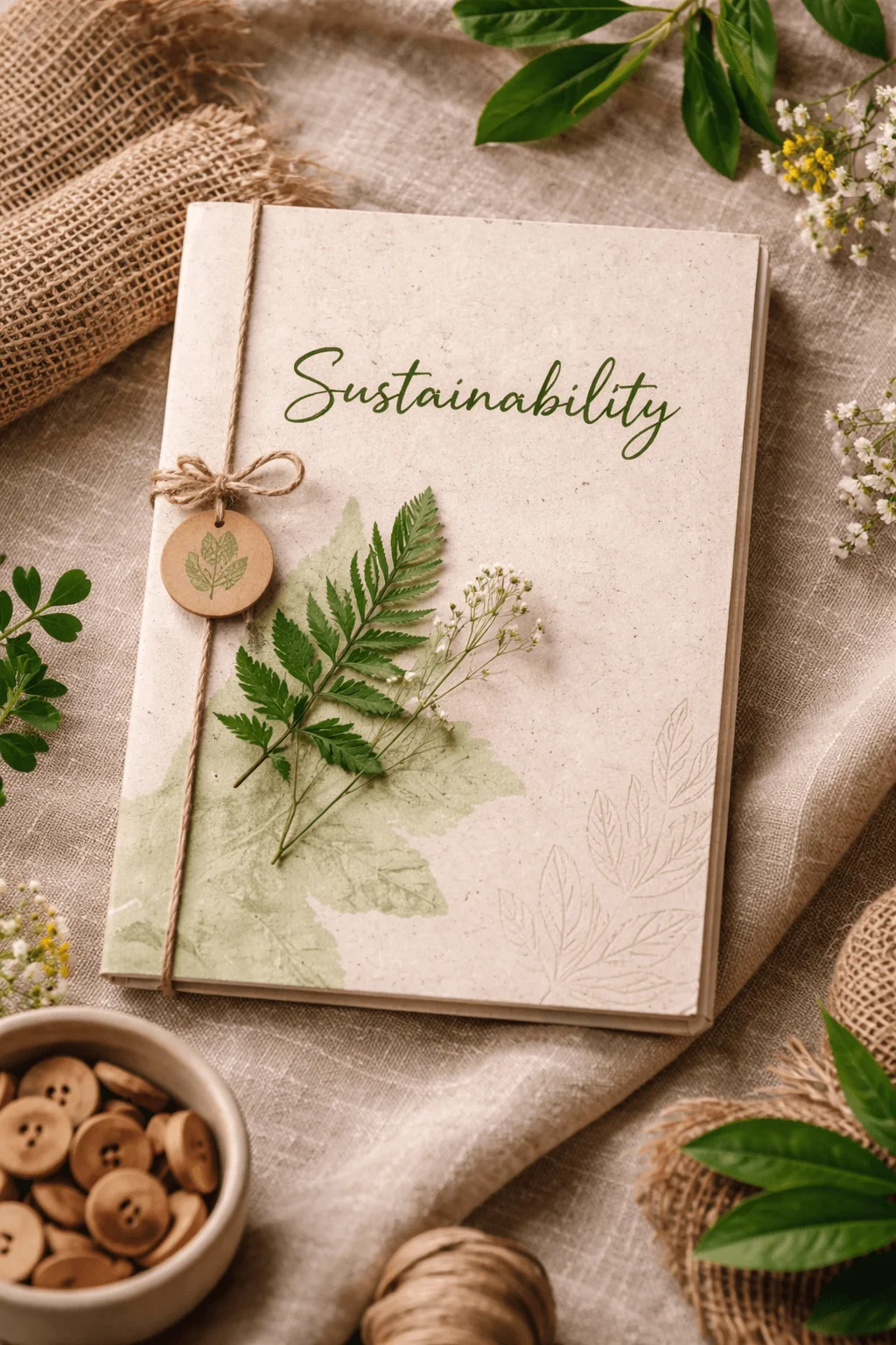
This approach enhances the perception of quality and authenticity. It suggests that the brand is paying attention to detail and genuinely investing in sustainable practices.
Designing for Digital First Experiences
The way people interact with brochures has changed significantly. Many users first encounter covers through screens, which has influenced how they are designed.
Digital first thinking means focusing on clarity, contrast, and adaptability. A cover must be recognizable even at a small size and on different devices.
This shift has led to simpler compositions with strong focal points. It ensures that the design remains effective across both print and digital environments.
The Influence of Artificial Intelligence in Visual Creation
Artificial intelligence is opening new possibilities for sustainability design. Designers are using AI tools to generate visuals that feel both natural and futuristic.
These images can represent complex ideas such as environmental change or technological innovation in unique ways. They often combine realism with imagination, creating a distinct visual identity.
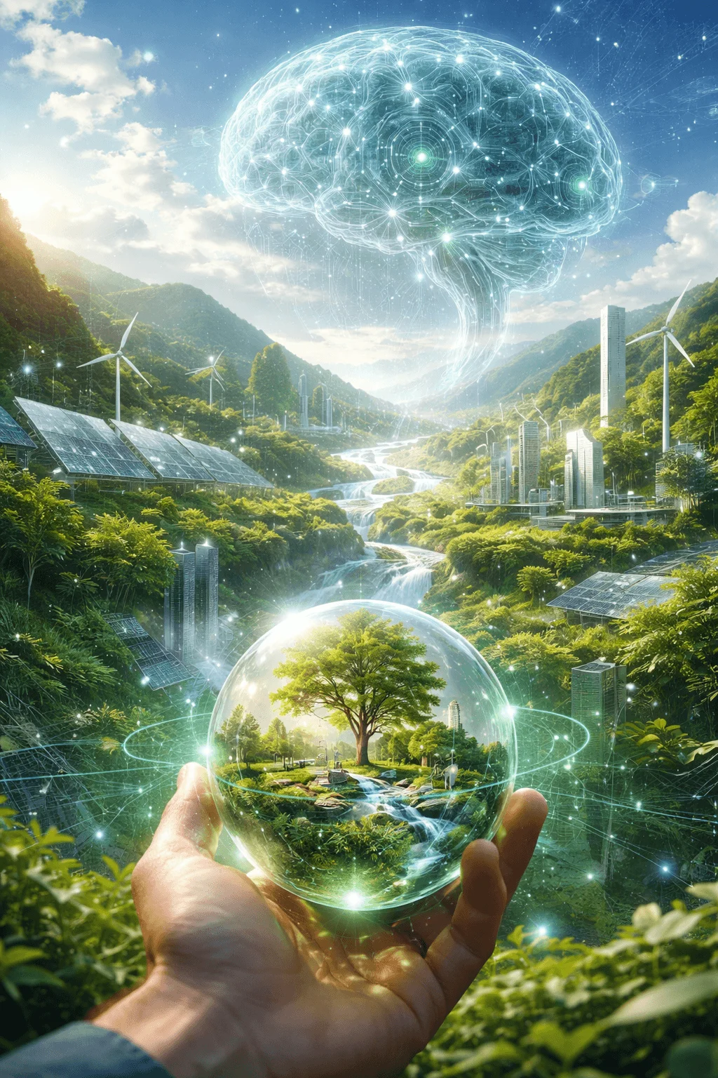
The use of AI also reflects the forward looking nature of sustainability, where technology plays a key role in solving environmental challenges.
Cultural Identity and Local Relevance
Sustainability is experienced differently across regions, and design is beginning to reflect that diversity. Incorporating cultural elements into brochure covers creates a stronger connection with specific audiences.
Patterns, colors, and visual references from local traditions add authenticity and depth. They show that the brand understands its context and is not relying on generic global imagery.
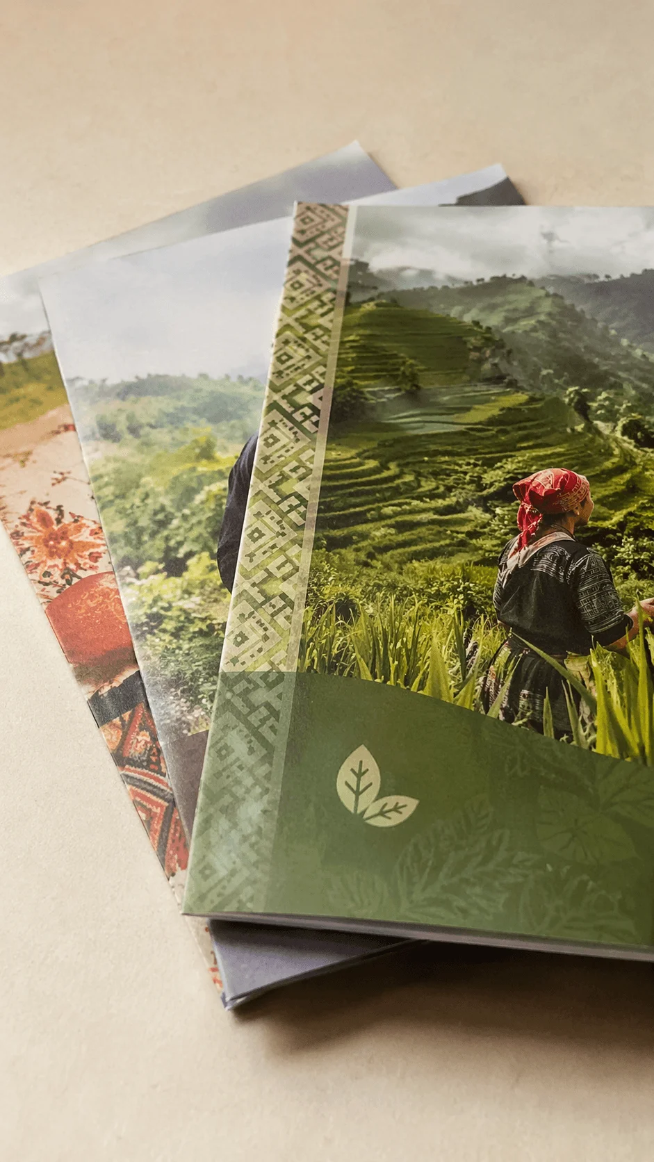
This approach makes sustainability feel more personal and grounded rather than abstract.
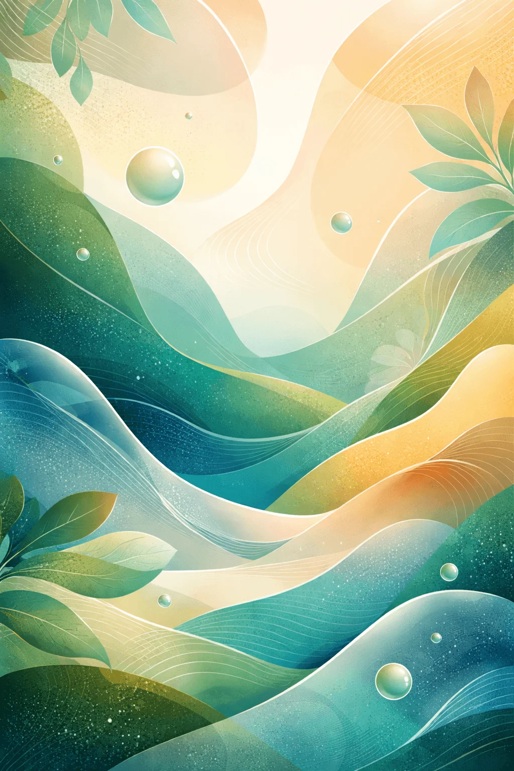
Fluid Forms and Gradual Transitions
Fluid shapes and smooth transitions are being used to represent natural movement and change. These forms create a sense of continuity and adaptability.
Gradients and flowing compositions suggest processes such as growth, transformation, and energy flow. They align visually with the idea of sustainability as a dynamic system.
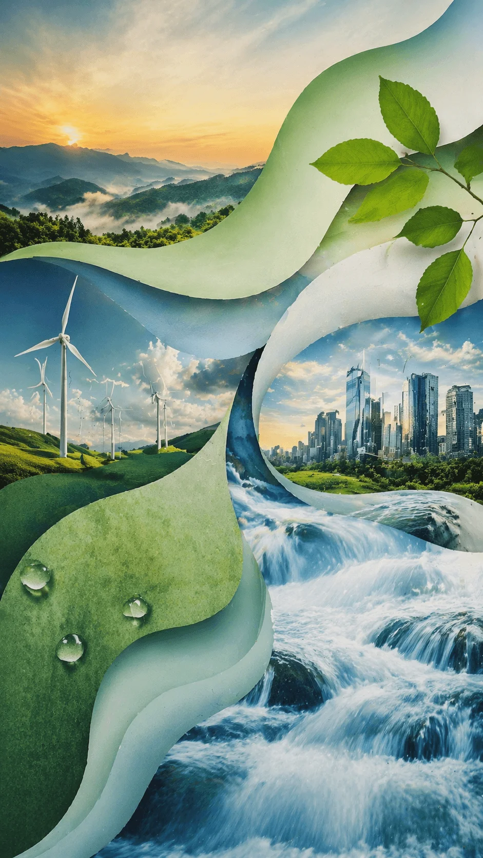
This style feels modern and visually engaging while maintaining a connection to natural principles.
Expressive and Bold Design Directions
While minimalism remains relevant, there is a growing interest in more expressive design. Rich compositions with multiple elements can communicate urgency and complexity.
This approach reflects the reality that sustainability is not a simple issue. It involves many layers and challenges that require attention.
When used thoughtfully, a more detailed and vibrant cover can capture interest and communicate depth without overwhelming the viewer.
Communicating Impact Through Visual Data
Transparency is becoming increasingly important in sustainability communication. Some brochure covers now include visual representations of data to highlight achievements.
Charts, symbols, and metrics can be integrated into the design in a way that remains visually appealing. This builds trust by showing measurable results rather than just statements.
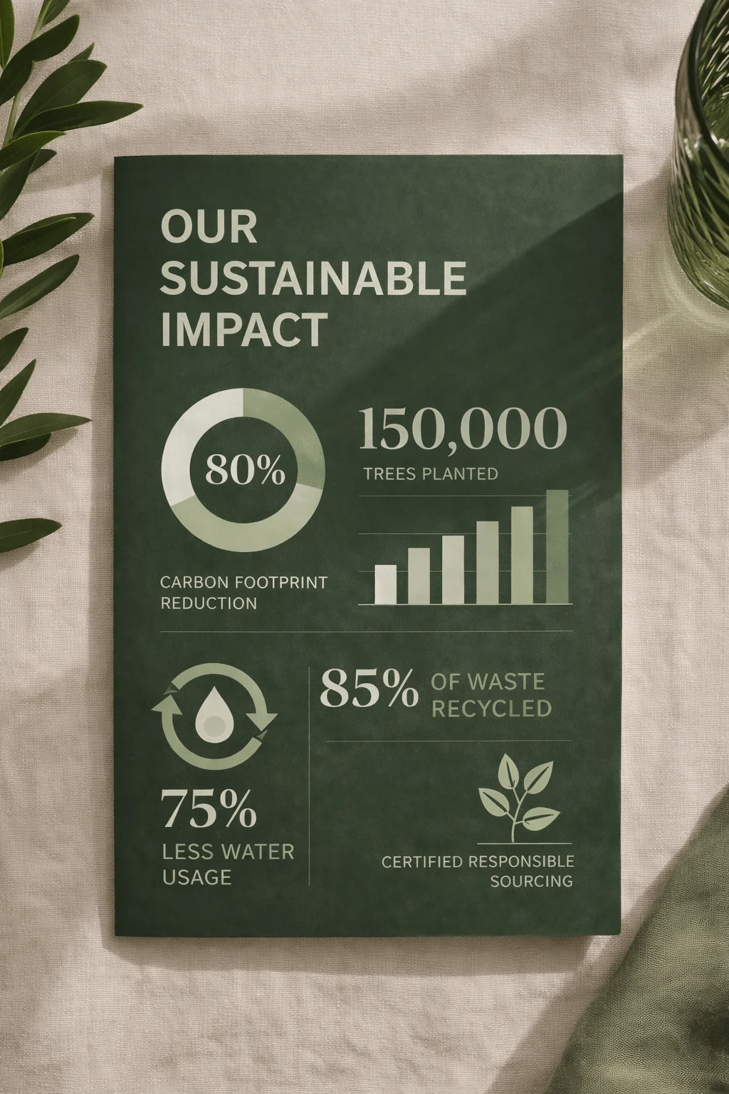
It also positions the brand as accountable and results driven.
Inspiration from Emerging Sustainable Materials
Advancements in sustainable materials are influencing design aesthetics. Visual elements inspired by natural fibers, recycled textures, and organic structures are becoming more common.
These references create a direct link between design and real world innovation. They make sustainability feel tangible and credible.
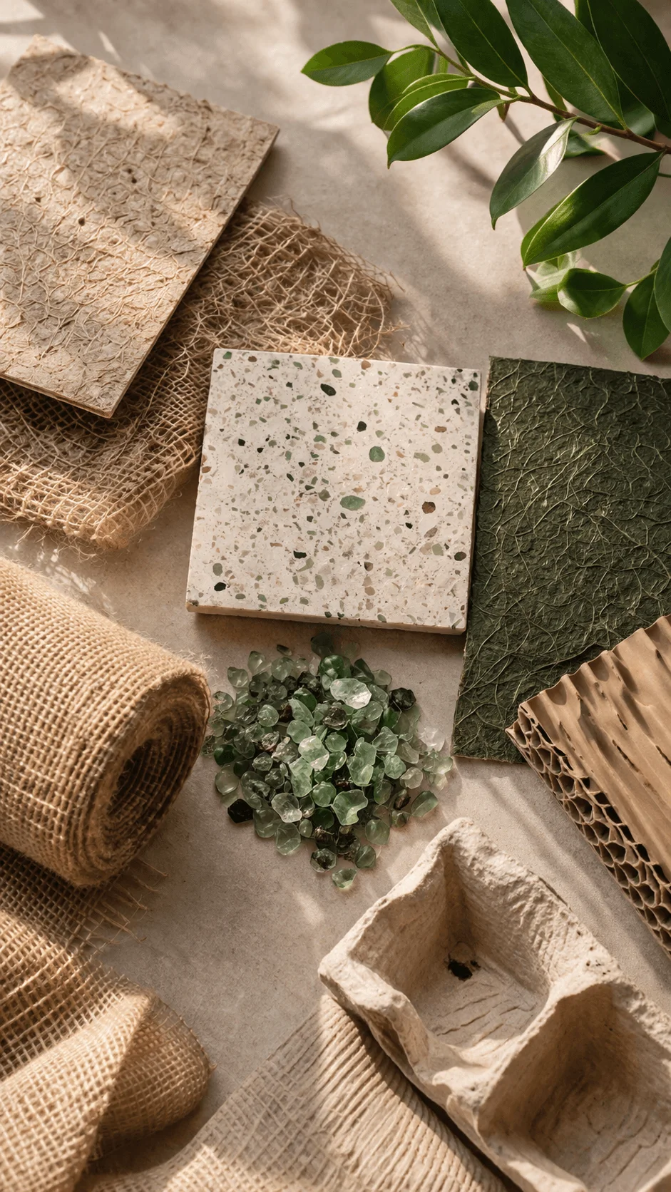
This approach also introduces new textures and patterns that keep the design fresh and contemporary.
Conclusion
Sustainability brochure cover design in 2026 is defined by depth, creativity, and authenticity. It is no longer about following predictable visual formulas. Instead, it is about expressing meaningful ideas through thoughtful design choices.
From narrative storytelling to digital first thinking, from cultural identity to advanced visual techniques, each trend reflects a broader shift toward more responsible and engaging communication. Designers are not just creating covers. They are shaping how sustainability is perceived and understood.
The most effective designs are those that go beyond appearance and connect with people on an emotional and intellectual level. By embracing these evolving ideas, designers and brands can create brochure covers that not only stand out but also inspire trust and action.