Best Digital Sustainability Report Design Ideas
Sustainability reporting has entered a new phase where digital experiences are replacing static documents. Organizations are no longer satisfied with publishing lengthy reports that are difficult to navigate and rarely read in full. Instead, they are embracing digital sustainability report design as a way to communicate impact, responsibility, and progress in a more meaningful and engaging way.
This transformation is driven by a shift in user behavior. Modern audiences expect clarity, speed, and interactivity. They want to explore information on their own terms, not follow a rigid document structure. As a result, sustainability reports are evolving into dynamic platforms that combine design, technology, and storytelling.
The Rise of Interactive Digital Report Experiences
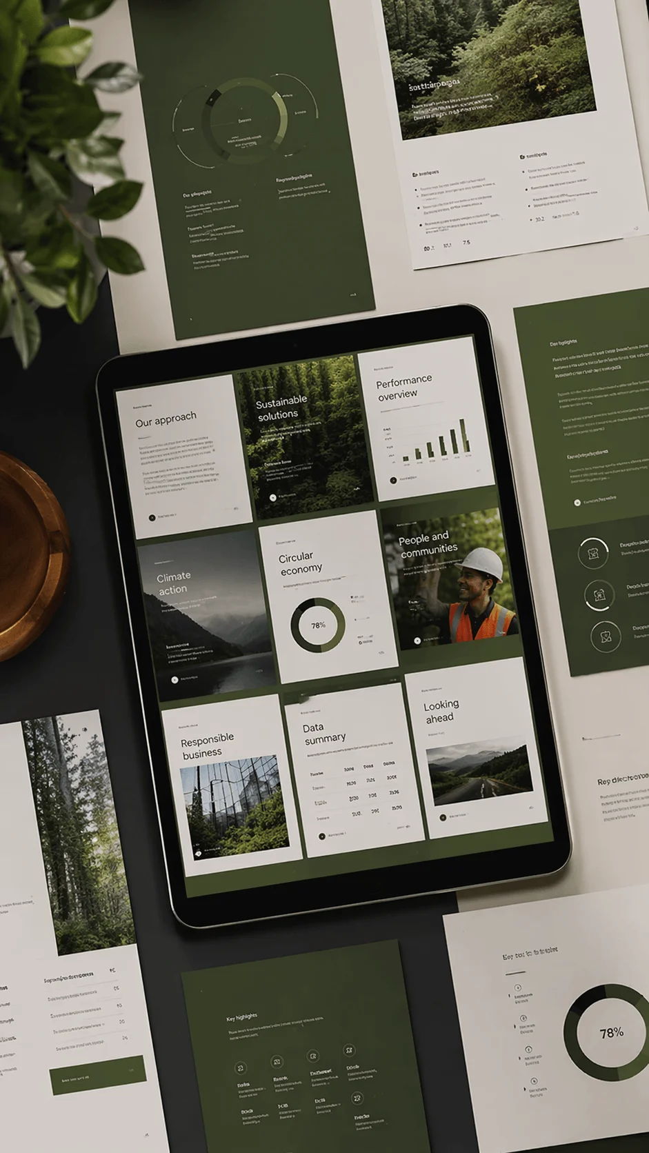
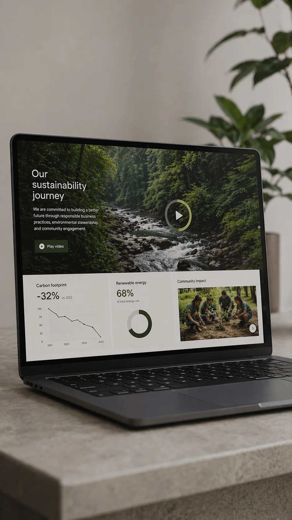
Digital sustainability report design is increasingly centered around interactive web based experiences. These reports function more like websites than documents, allowing users to move freely between sections and engage with content in a flexible way.
The importance of this shift goes beyond aesthetics. Interactivity changes how information is consumed. Instead of passively reading, users actively explore. They can click through different layers, filter data, and focus on what matters to them. This creates a deeper level of engagement and ensures that key messages are not lost in overwhelming text.

Interactive sustainability report examples show that companies are investing in navigation systems that feel intuitive and natural. Smooth scrolling, clickable sections, and responsive layouts all contribute to a seamless experience that encourages exploration.
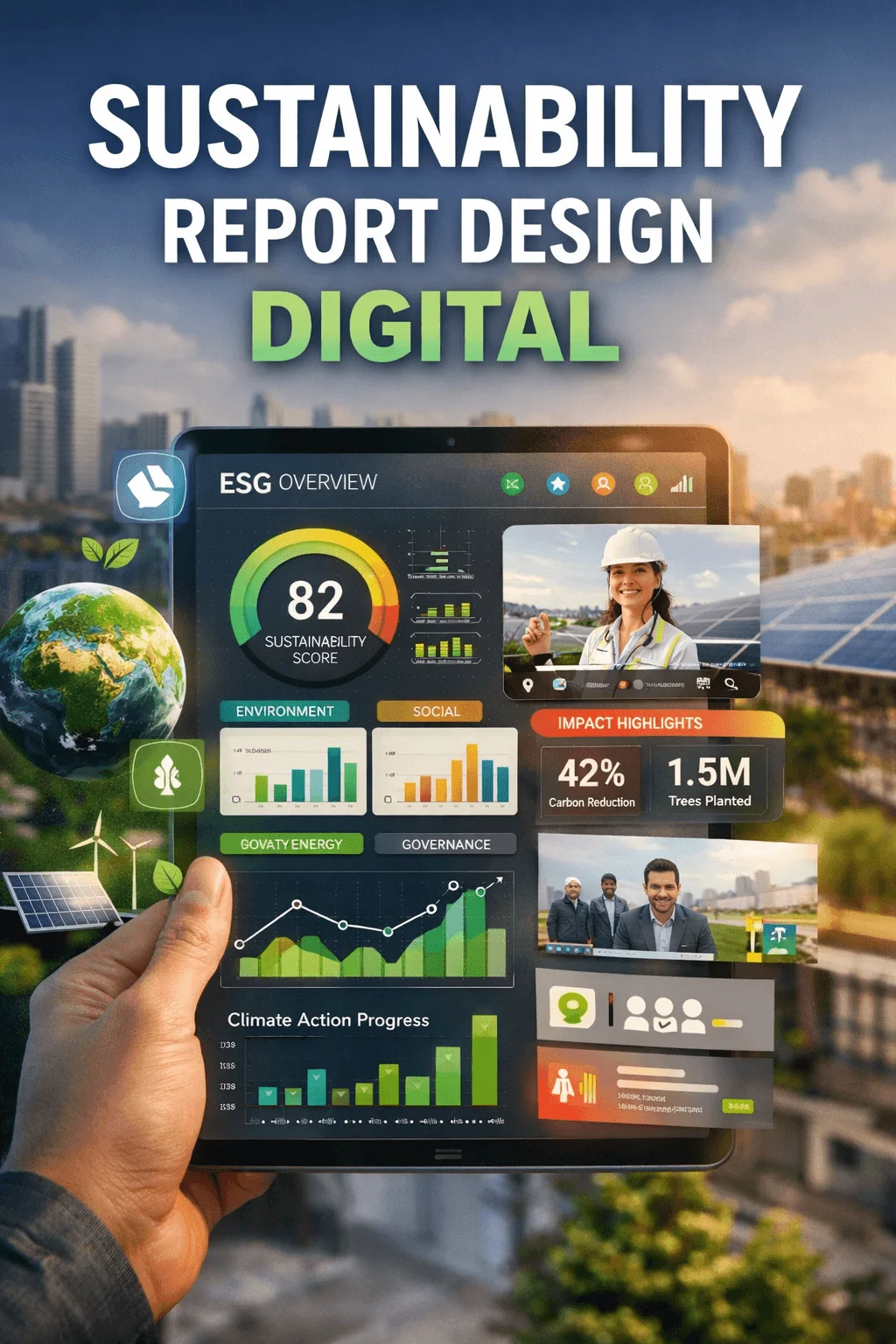
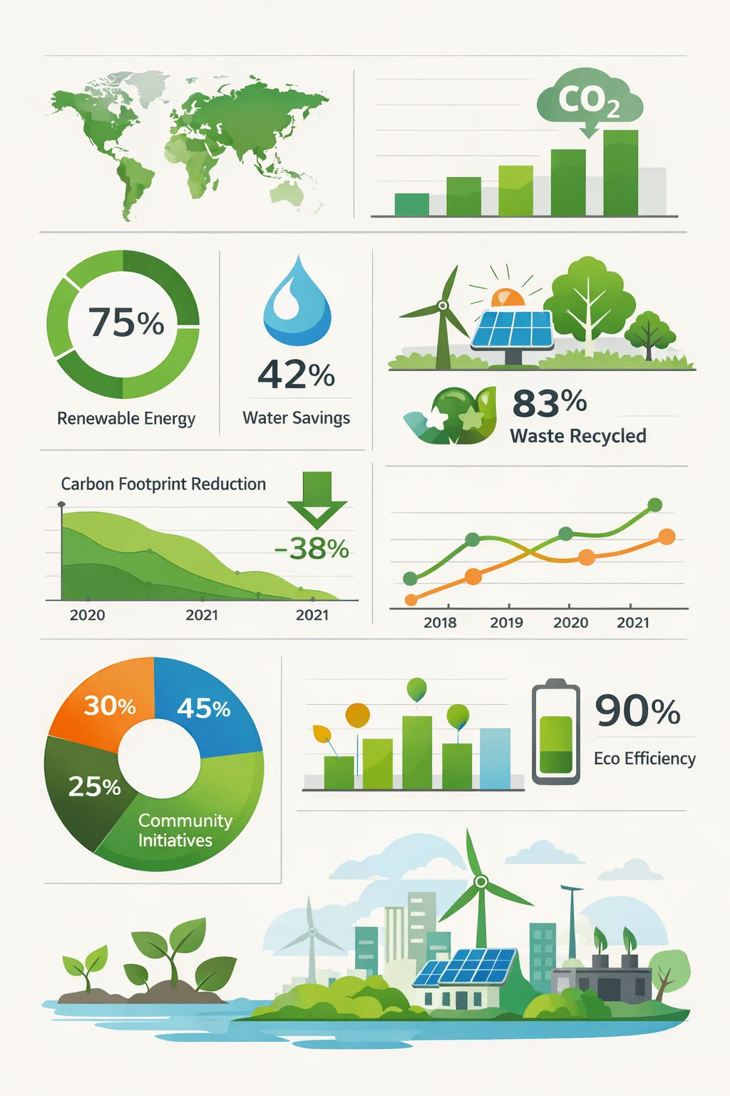
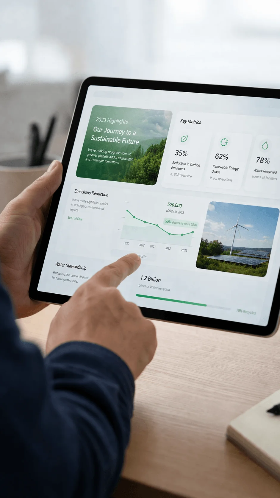
ESG Dashboard Design for Clear Communication
One of the most influential ideas shaping digital sustainability report design is the use of dashboard style interfaces. These designs present key metrics in a structured and visually clear format, making complex data easier to understand.
Sustainability dashboard report design focuses on clarity rather than decoration. It allows users to quickly grasp performance indicators related to environmental, social, and governance factors. This approach is particularly valuable for stakeholders who need quick insights without going through extensive explanations.

The growing popularity of ESG report website design ideas reflects a broader trend toward data driven communication. Organizations are realizing that clarity builds trust, and dashboards provide a direct and transparent way to present information.
Blending Storytelling with Data for Deeper Impact
Modern sustainability storytelling design examples highlight the importance of combining narrative with data. Numbers alone do not create meaning. They need context, explanation, and emotional connection.
Digital sustainability report design now integrates storytelling elements that guide users through the organization’s journey. This includes explaining challenges, showcasing progress, and highlighting real world impact. When data is presented within a story, it becomes more relatable and easier to understand.
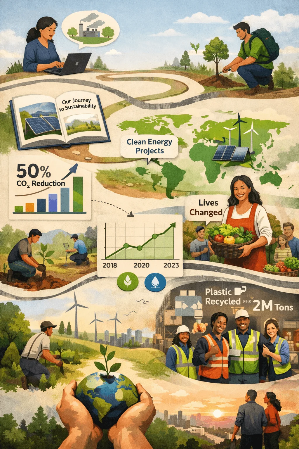
This approach also allows companies to communicate their values more effectively. It shifts the focus from compliance to communication, creating a more human and engaging experience.
Micro Interactions That Enhance User Engagement
Micro interactions are small design elements that respond to user actions. In digital sustainability reports, they play a significant role in improving usability and engagement.
When users hover over a chart and see additional details or scroll through a section that reveals animations, the experience becomes more interactive and intuitive. These subtle features guide users through the content and make complex information easier to digest.
Micro interactions also create a sense of responsiveness that keeps users engaged. They transform the report from a static presentation into a living experience that reacts to user input.
Modular Content Systems for Scalable Design
Modular design is becoming a foundational concept in digital sustainability report design. Instead of long continuous sections, content is organized into smaller units that can stand independently.
This approach improves readability by breaking information into manageable pieces. It also allows designers to rearrange content based on different needs and platforms. As sustainability reports become more complex, modular systems provide the flexibility needed to manage large amounts of information.
From a strategic perspective, modular design also supports consistency. Each section follows a similar structure, making the overall experience more cohesive and easier to navigate.
Mobile First Design and Changing User Behavior
Mobile devices have become a primary way for users to access content, and sustainability reports must adapt to this reality. Sustainability report UX design now prioritizes mobile first principles to ensure accessibility and usability.
Designing for mobile requires a different mindset. Content must be concise, navigation must be simple, and visuals must be optimized for smaller screens. This often leads to cleaner and more focused designs that benefit all users, not just those on mobile devices.
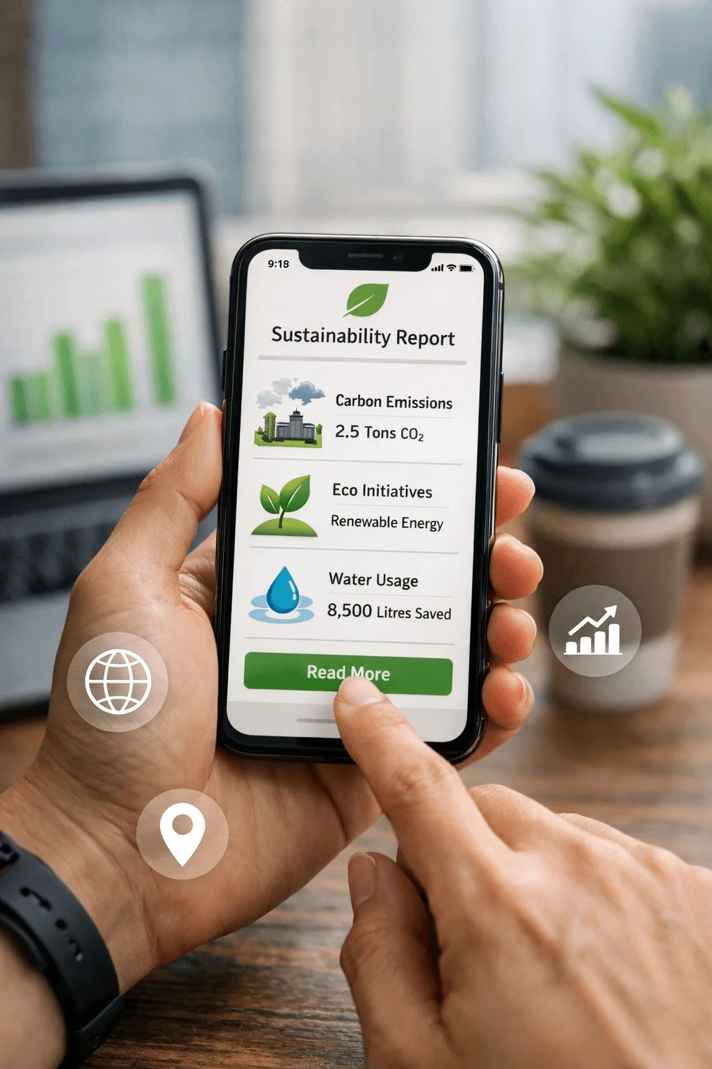
Mobile first design also reflects a broader shift toward convenience. Users expect to access information quickly and easily, regardless of where they are.
Personalized User Journeys for Different Stakeholders
Digital sustainability reports are moving toward personalized experiences that cater to different audiences. Investors, customers, employees, and regulators all have unique interests, and a single linear report cannot effectively serve them all.
Personalized user journeys allow individuals to choose the content that is most relevant to them. This can include filtering information, selecting topics, or following specific pathways through the report.
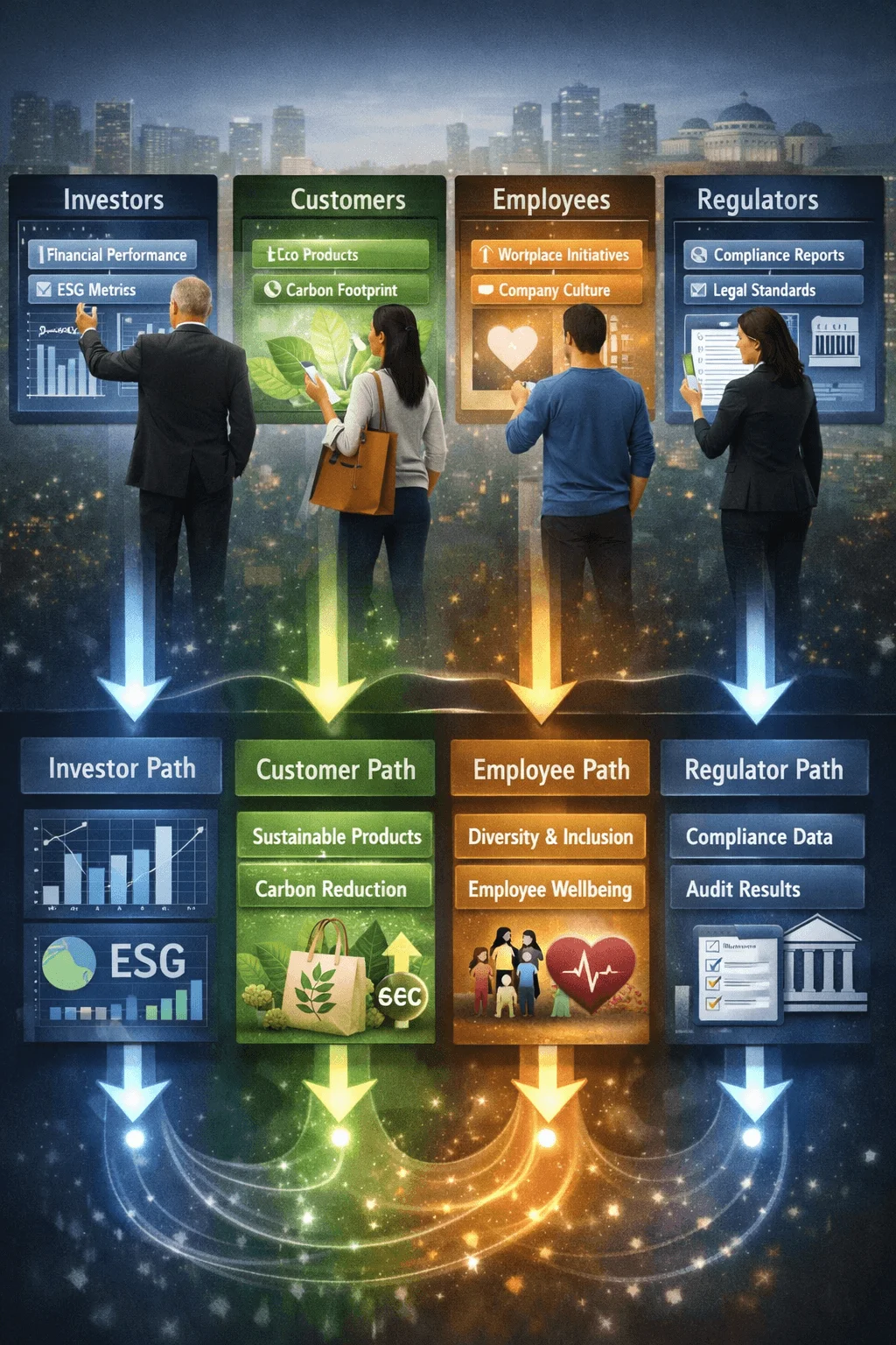
This approach enhances user satisfaction and ensures that each stakeholder group can find the information they need without unnecessary complexity.
AI Assisted Insights and Summaries
Artificial intelligence is beginning to influence how sustainability reports are designed and consumed. AI assisted features can generate summaries, highlight key insights, and help users navigate large amounts of information.
This is particularly valuable in complex reports where users may not have the time to read everything. AI can provide a quick overview while still allowing users to explore details if they wish.
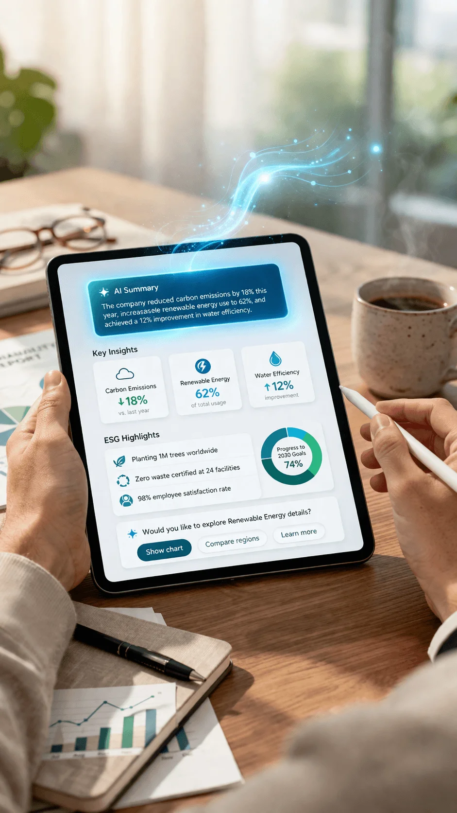
The integration of AI also signals a shift toward smarter digital experiences where technology actively supports user understanding.
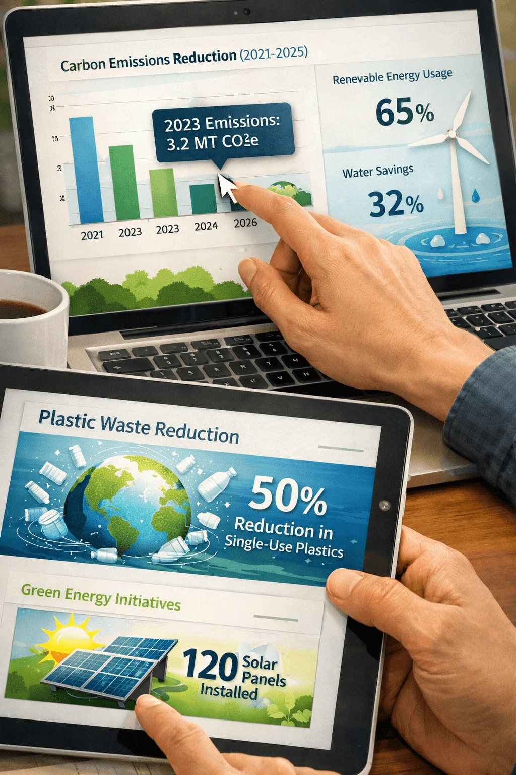
Data Visualization as the Core Communication Tool
In digital sustainability report design, data visualization has become a primary method of communication. Charts, graphs, and visual indicators are used to present information in a way that is both clear and engaging.
The focus is on simplicity and accuracy. Effective data visualization does not overwhelm the user but instead highlights key insights and trends. This makes it easier for users to interpret complex data and draw meaningful conclusions.
Strong visual design also improves retention, helping users remember the information they have seen.
Layered Transparency and Drill Down Content
One of the challenges in sustainability reporting is balancing simplicity with detail. Digital design addresses this through layered information structures that allow users to explore content at different levels.
At the top level, users see summaries and key highlights. From there, they can drill down into more detailed data if they choose. This approach ensures that the report is accessible to a wide audience while still providing depth for those who need it.
Layered transparency also supports accountability by making detailed information easily accessible.
Integration with ESG Frameworks and Standards
Sustainability reports must align with established frameworks, and digital formats are making this process more efficient. Structured layouts and interactive elements allow organizations to present data in a way that meets compliance requirements while remaining user friendly.

This integration ensures that reports are both credible and accessible. It also simplifies the process of updating and maintaining information as standards evolve.
Multimedia and Rich Content Integration
Digital sustainability report design is expanding beyond text and static visuals. Multimedia elements such as video, animation, and interactive graphics are becoming more common.
These elements provide new ways to communicate complex ideas and engage users. For example, a short video can explain a sustainability initiative more effectively than a long paragraph.
Multimedia also adds variety to the report, keeping users interested and encouraging them to explore further.
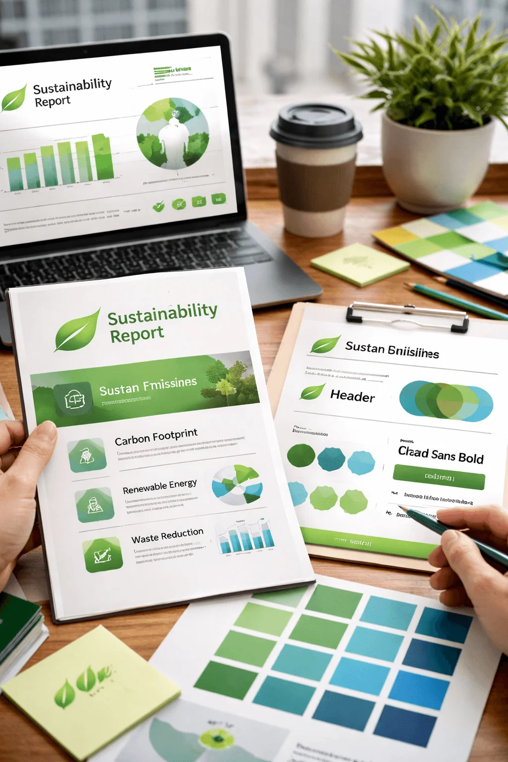
Brand Identity and Visual Consistency
Sustainability reports are increasingly being designed as extensions of brand identity. This means using consistent colors, typography, and visual styles that align with the organization’s overall image.
A strong visual identity helps build trust and recognition. It also makes the report feel more cohesive and professional. When design elements are aligned with brand values, the report becomes a powerful communication tool.
Accessibility as a Core Design Principle
Accessibility is an essential aspect of modern sustainability report UX design. Reports must be usable by people with different abilities, including those who rely on assistive technologies.
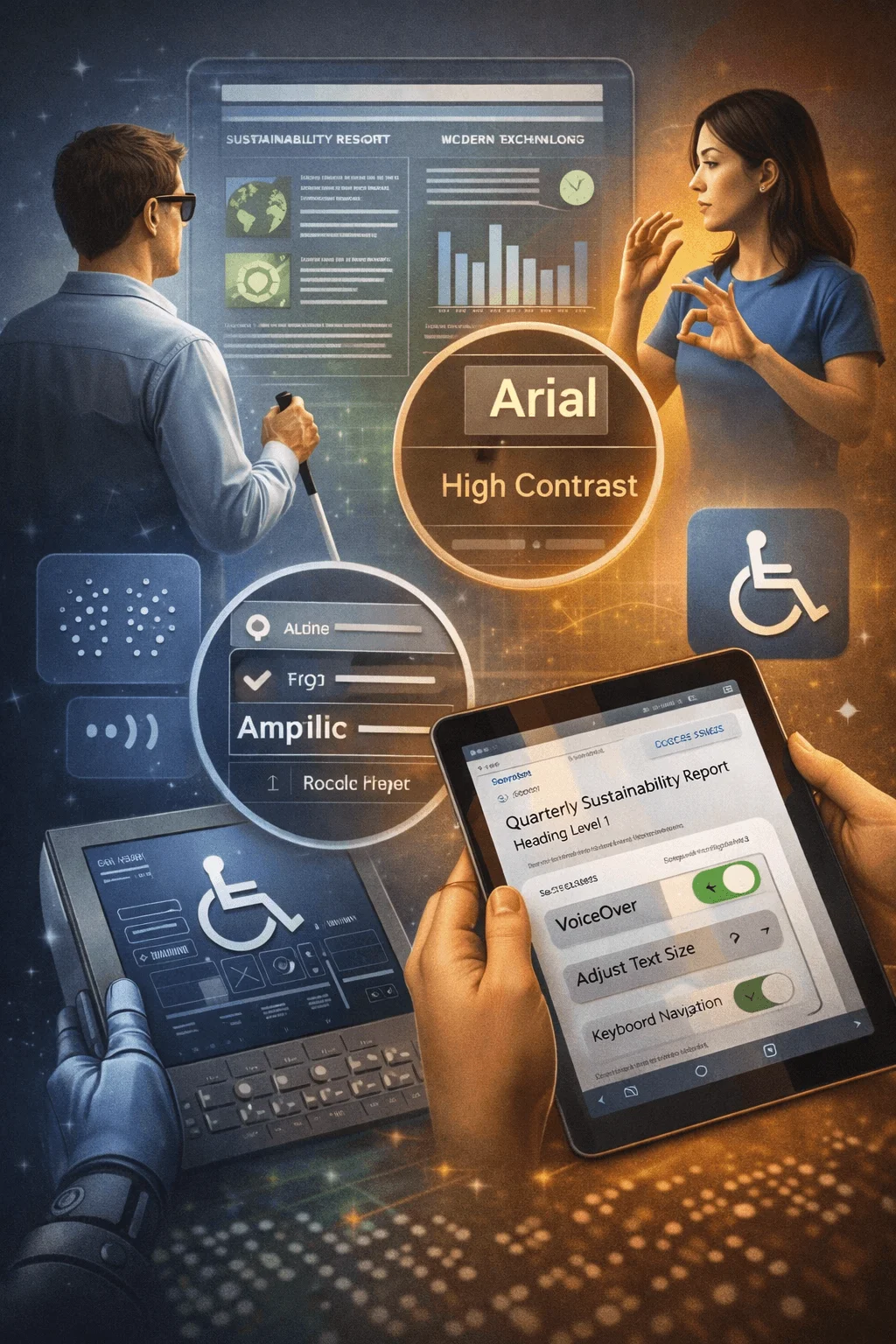
This involves using readable fonts, clear contrast, and proper structure to ensure that content is accessible to all users. Accessibility is not just a technical requirement but also a reflection of inclusivity and responsibility.
Carbon Conscious Digital Design
An emerging concept in digital sustainability report design is the idea of reducing the environmental impact of digital products. This involves optimizing performance, reducing file sizes, and minimizing unnecessary elements.
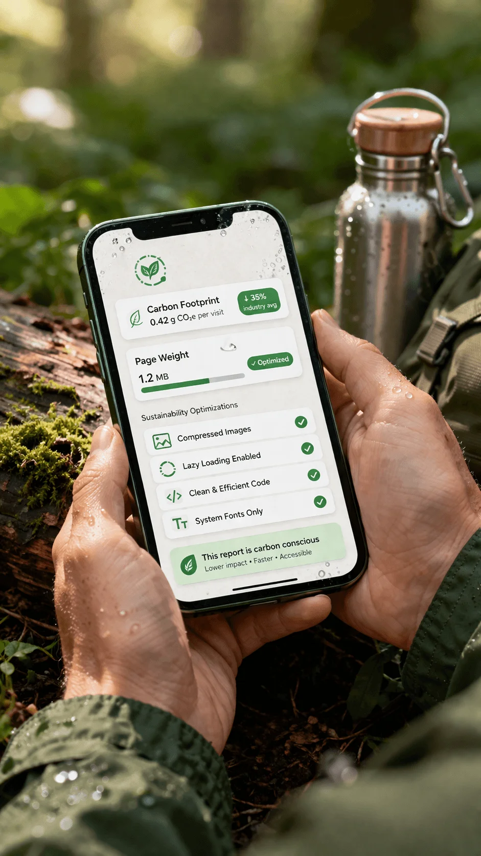
By creating efficient digital experiences, organizations can align their design practices with their sustainability goals. This adds authenticity to their messaging and demonstrates a commitment to responsible innovation.
Conclusion
Digital sustainability report design represents a significant evolution in how organizations communicate their impact and responsibilities. By embracing interactivity, user focused design, and advanced technology, companies can create reports that are not only informative but also engaging and accessible.
As digital experiences continue to shape user expectations, organizations that invest in thoughtful and innovative design will stand out. The future of sustainability reporting lies in creating experiences that are clear, transparent, and deeply connected to the needs of modern audiences.