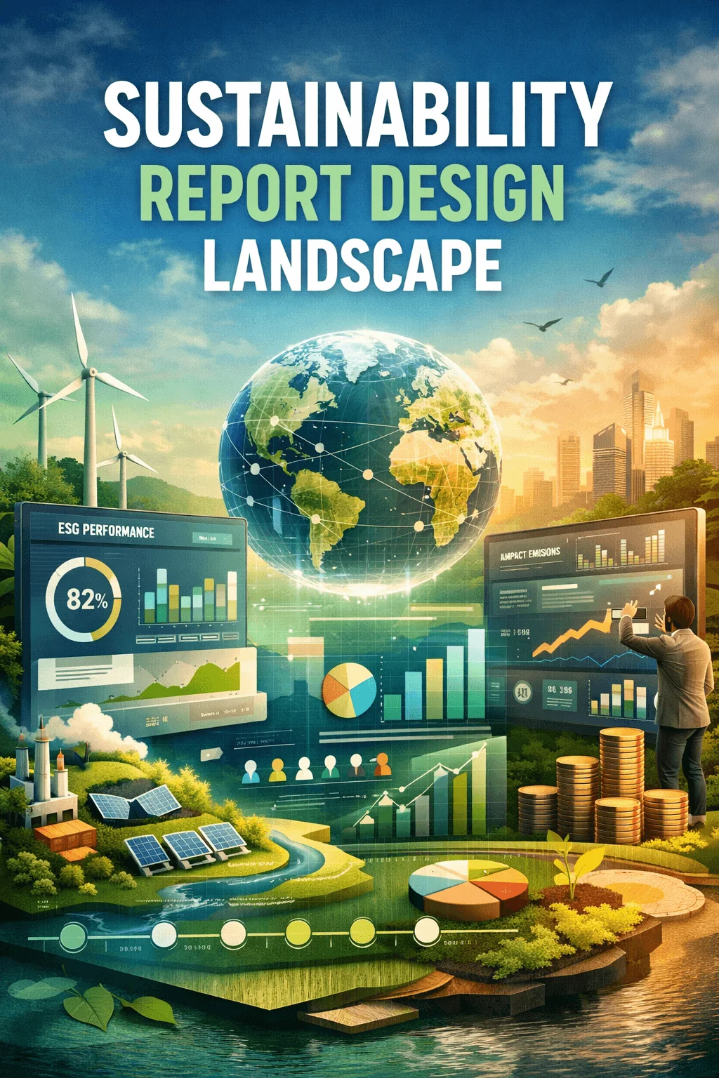
Sustainability Report Design Landscape 2026
The sustainability report is no longer just a formal document created once a year to meet regulatory expectations. It has become a strategic communication tool that reflects how an organization thinks, operates, and builds trust with its stakeholders. In 2026, the sustainability report design landscape is undergoing a significant transformation as businesses respond to rising expectations for transparency, clarity, and meaningful engagement.
What makes this shift particularly important is the growing complexity of environmental, social, and governance data. Companies are dealing with vast amounts of information that must be communicated clearly to investors, regulators, customers, and the public. Traditional report formats are no longer capable of handling this complexity effectively. As a result, design has emerged as a critical factor in shaping how sustainability information is understood and valued.
This new landscape is defined by the convergence of design thinking, digital experience, and storytelling. Sustainability reports are evolving into structured yet flexible systems that prioritize usability, readability, and emotional connection. The focus is no longer just on presenting information but on creating an experience that allows users to explore, interpret, and trust the data.
The Evolution from Static Reports to Living Experiences
One of the most important developments in the sustainability report design landscape 2026 is the transition from static documents to living experiences. Reports are no longer confined to fixed formats that present information in a rigid sequence. Instead, they are becoming dynamic environments where content can evolve, update, and respond to user interaction.
This change reflects a broader shift in digital behavior. People are accustomed to interactive platforms where information is not consumed passively but explored actively. Sustainability reports are now designed to follow this pattern. They allow users to move through content in a way that feels intuitive and engaging, rather than overwhelming.
The idea of a living report also introduces the possibility of continuous updates. Instead of waiting for an annual release, organizations can present data in a more timely manner. This not only improves relevance but also strengthens credibility by showing that sustainability is an ongoing commitment rather than a once a year exercise.
Interactive Digital Design as the Core Foundation
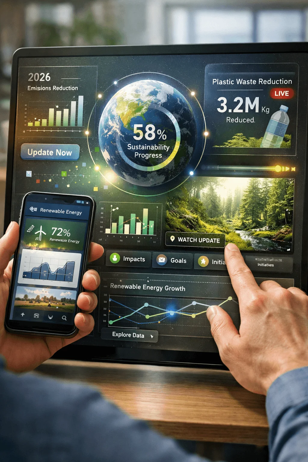
Interactive sustainability report design has moved from being an advanced feature to becoming the foundation of modern reporting. Interactivity changes the relationship between the reader and the content. Instead of simply receiving information, the user becomes part of the experience.
This approach allows for deeper engagement because it gives users control. They can choose what to explore, how deeply to go into a topic, and which sections are most relevant to their interests. This level of flexibility is especially important in sustainability reporting, where different stakeholders have different priorities.
Interactivity also supports layered communication. Complex topics can be introduced at a high level and then expanded for users who want more detail. This prevents information overload while still providing depth for those who need it. The result is a report that feels both accessible and comprehensive at the same time.
Data Visualization as the Language of Understanding
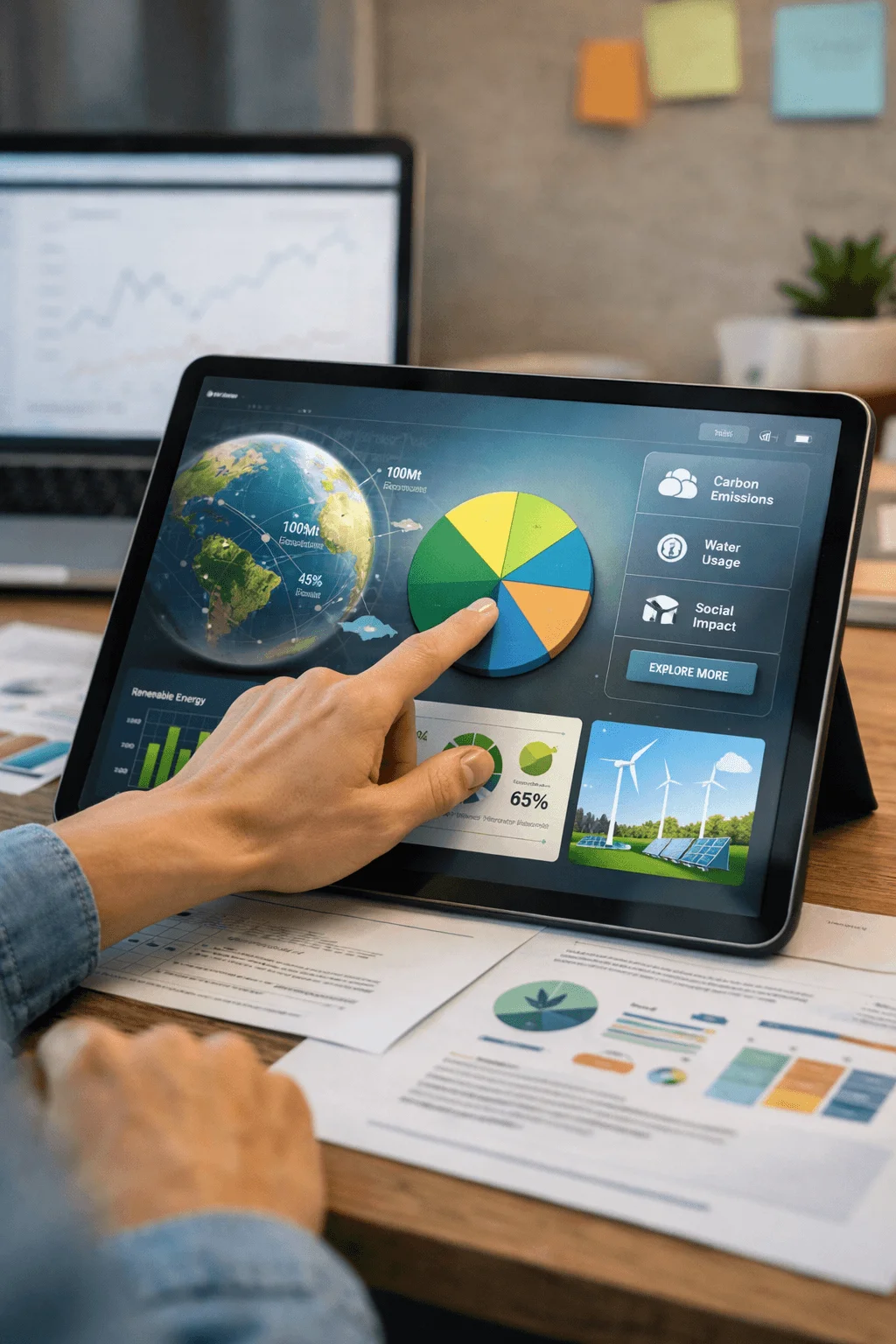
In 2026, data visualization is not just a design element but the primary language through which sustainability information is communicated. The increasing volume of ESG data has made it impossible to rely on text alone. Visual systems are now essential for transforming complex information into clear and meaningful insights.
What makes this shift significant is the way visualization is being integrated into the structure of the report. It is no longer treated as an addition but as a core component of the narrative. Charts, diagrams, and visual indicators are carefully designed to guide interpretation and highlight key messages.
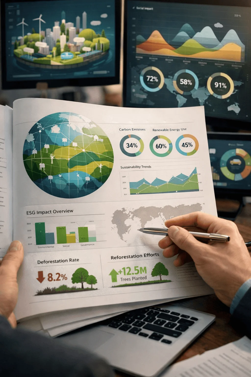
Effective visualization goes beyond aesthetics. It requires a deep understanding of the data and the audience. Designers must decide what to emphasize, what to simplify, and how to present relationships between different variables. When done correctly, visualization not only improves comprehension but also builds confidence in the information being presented.
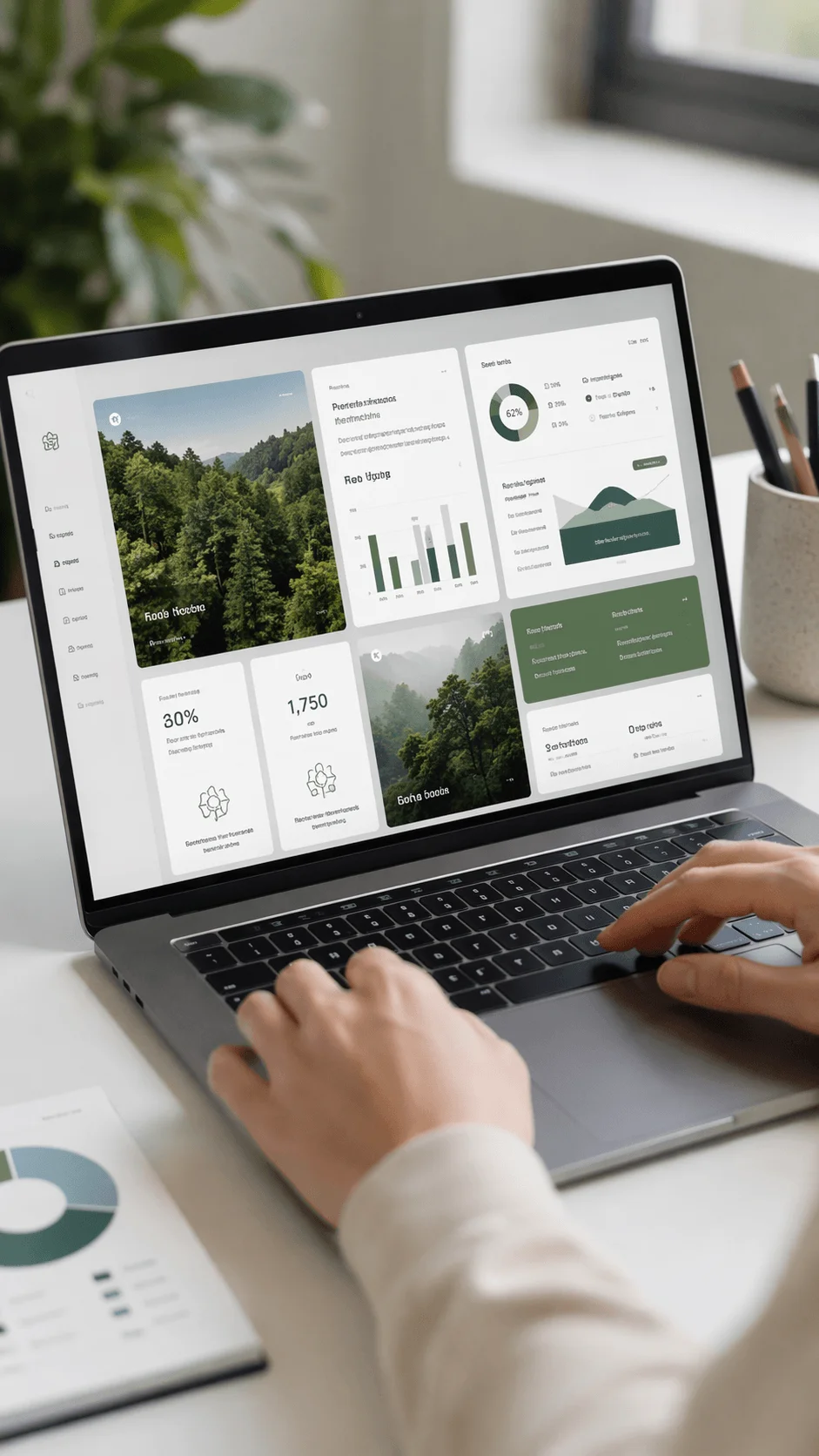
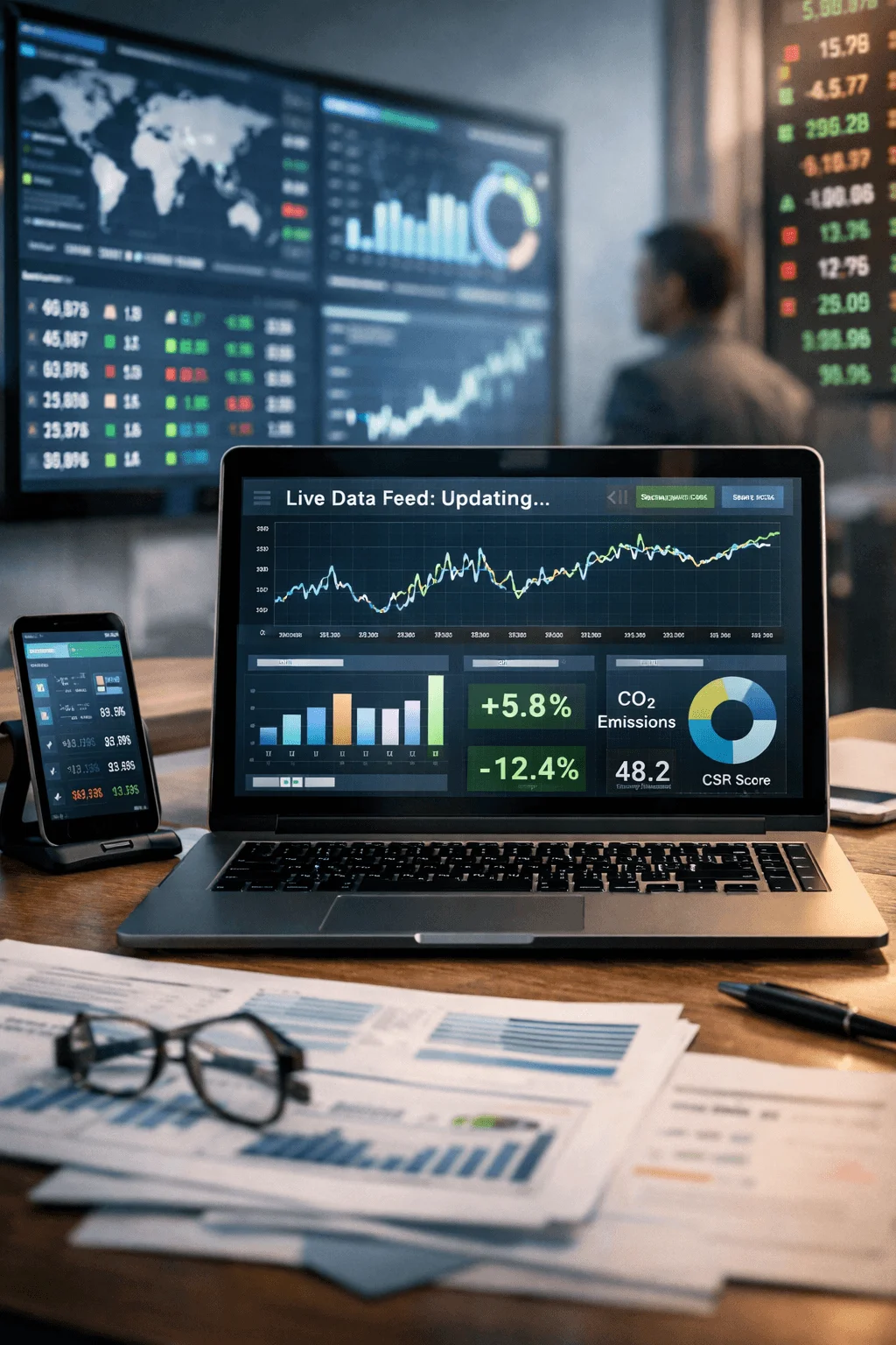
Dashboard Style Thinking and Information Clarity
The influence of digital dashboards is clearly visible in ESG dashboard report design. This approach is based on the idea that users should be able to understand key information at a glance. Instead of searching through pages of content, readers can quickly access the most important metrics.
Dashboard thinking introduces a new level of clarity and efficiency. Information is organized into distinct sections that each serve a specific purpose. This structure makes it easier to compare data, identify trends, and draw conclusions.
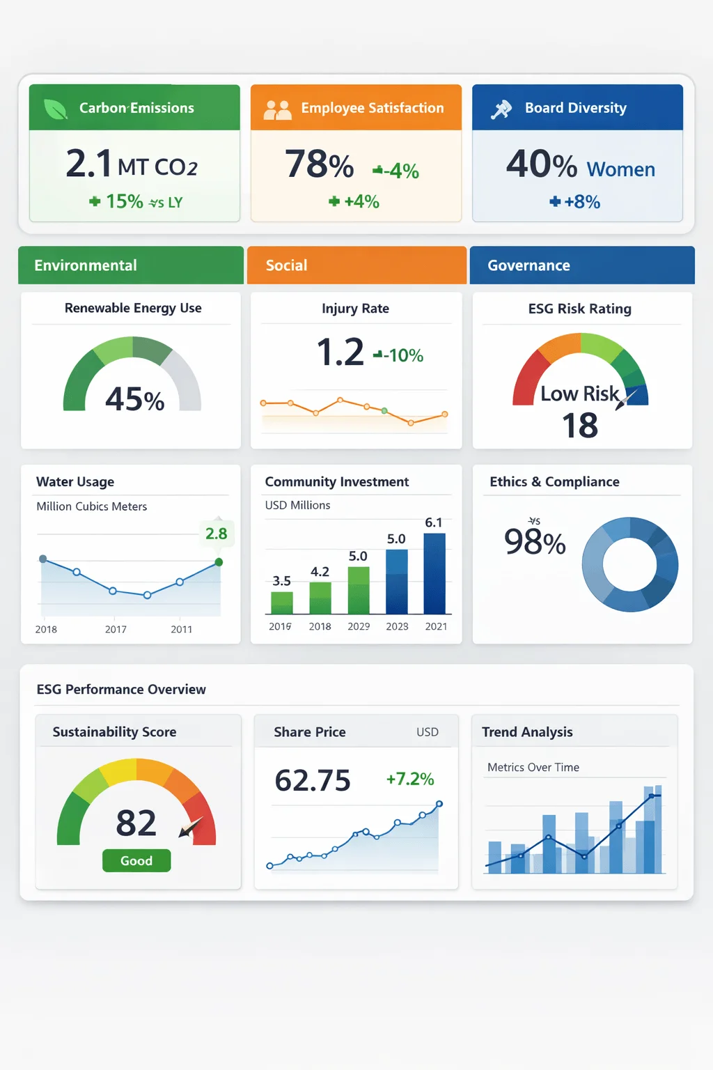
What is particularly valuable about this approach is its ability to support decision making. Investors and analysts often need to evaluate performance quickly. A well designed dashboard provides them with the insights they need without unnecessary complexity. This makes the report not only informative but also actionable.
Modular Design Systems and Structural Flexibility
Modern sustainability report layout ideas are increasingly based on modular systems. This means that content is divided into smaller units that can function independently while still contributing to the overall structure.
This approach offers several advantages. It allows for greater flexibility in how content is arranged and presented. Sections can be reorganized, updated, or reused without disrupting the entire report. This is especially useful in digital formats where content may need to adapt to different screen sizes and devices.
Modular design also improves readability. By breaking information into manageable parts, it reduces cognitive load and makes it easier for users to focus on specific topics. Each module can be designed to deliver a clear and concise message, which enhances overall understanding.
Storytelling as a Strategic Communication Tool
Sustainability reporting is increasingly being shaped by storytelling. Data alone is not enough to create impact. It needs to be placed within a context that explains why it matters and how it relates to real world outcomes.
Storytelling transforms the report from a collection of facts into a coherent narrative. It guides the reader through the organization’s journey, highlighting challenges, actions, and results. This approach makes the content more engaging and memorable.
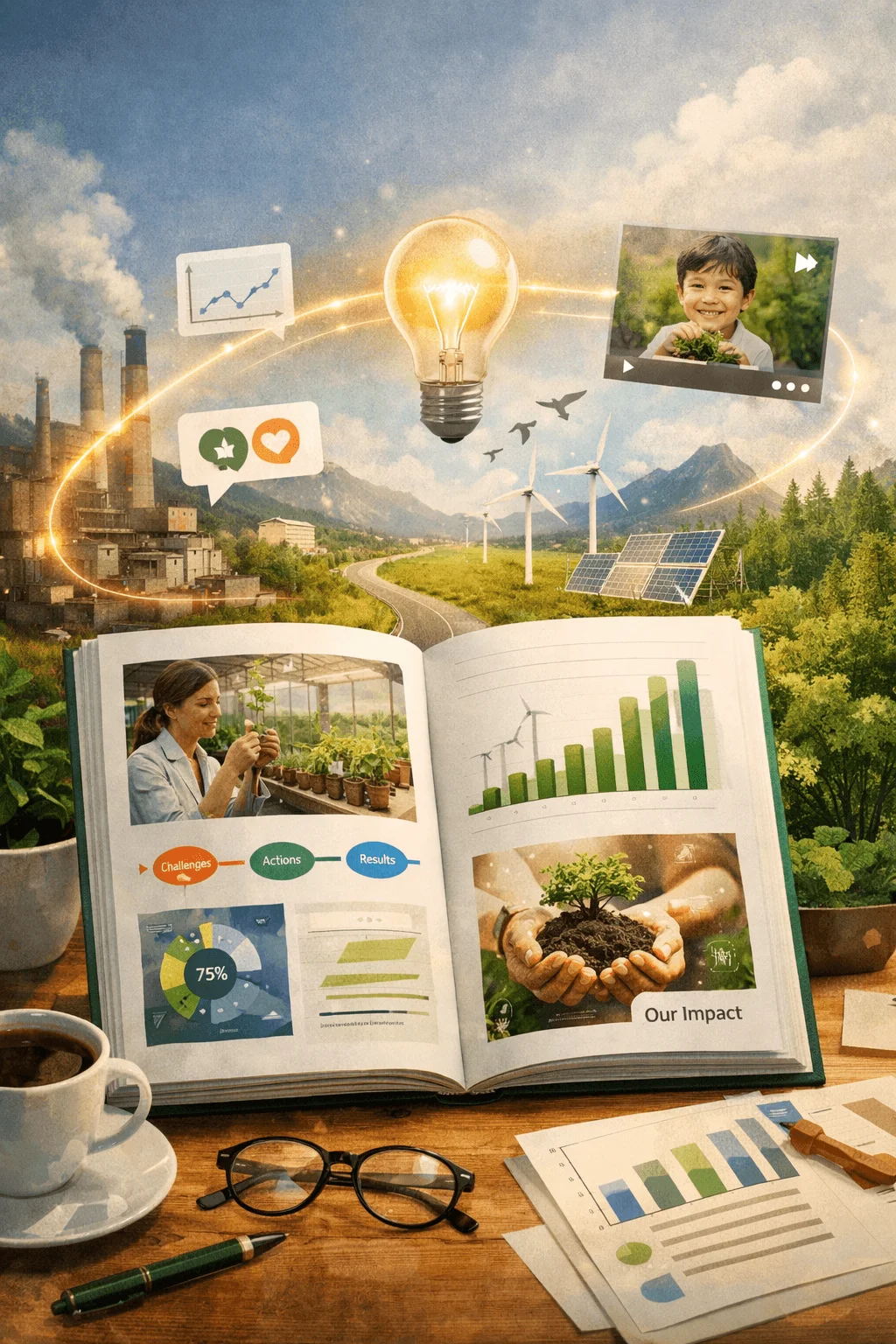
What sets modern storytelling apart is its integration with design. Visual elements, layout, and typography all work together to support the narrative. This creates a seamless experience where the story unfolds naturally as the reader moves through the report.
Connecting Sustainability to Business Performance
A major shift in ESG report design trends 2026 is the emphasis on linking sustainability to business performance. Organizations are expected to demonstrate how their environmental and social initiatives contribute to financial success and long term stability.
This connection is being expressed through design in increasingly sophisticated ways. Visual systems are used to show relationships between sustainability metrics and business outcomes. This helps stakeholders understand the value of sustainability beyond compliance.

By making this connection clear, reports become more relevant to decision makers. They show that sustainability is not a separate activity but an integral part of the business strategy. This strengthens the overall narrative and enhances credibility.
Integration of Financial and Sustainability Reporting
The integration of financial and sustainability reporting represents a significant evolution in the reporting landscape. Instead of producing separate documents, organizations are combining these elements into a unified report.
This requires a careful balance between detail and clarity. Financial data and sustainability data have different characteristics and audiences. Bringing them together in a cohesive way is a complex design challenge.
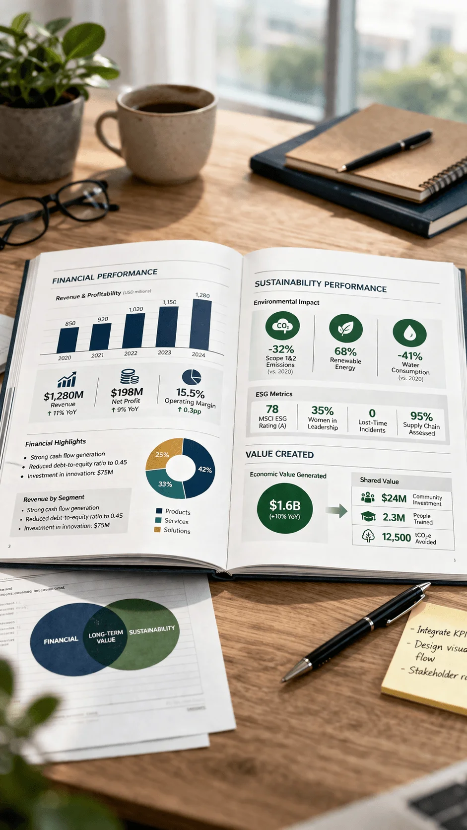
Successful integration depends on strong structure and clear visual hierarchy. The report must guide the reader through different types of information without creating confusion. When done well, it provides a more complete and accurate picture of the organization’s performance.
Visualizing Supply Chains and Transparency
Transparency has become a central theme in sustainability reporting, and design plays a crucial role in making it visible. One of the most effective approaches is the use of visual systems to represent supply chains.
These visualizations allow organizations to show how their products and services are connected to different regions, partners, and processes. They make it easier to understand the scope and complexity of operations.
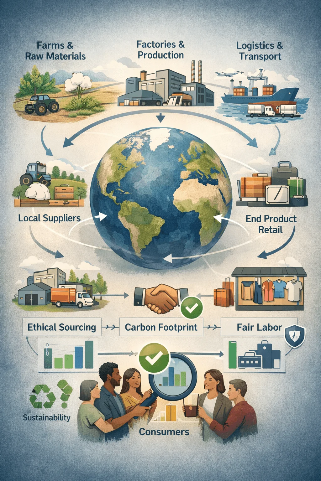
More importantly, they provide a way to communicate accountability. By clearly presenting supply chain data, companies can demonstrate their commitment to responsible practices. This builds trust and supports more informed decision making.
Artificial Intelligence in Design and Content Creation
Artificial intelligence is beginning to influence how sustainability reports are created and designed. AI tools can assist in organizing data, identifying patterns, and generating content structures.
This technology has the potential to make reporting more efficient and responsive. It can help designers focus on higher level decisions while automating repetitive tasks. It also opens up new possibilities for personalization and adaptation.

However, the use of AI also introduces new responsibilities. Accuracy, transparency, and ethical considerations must be carefully managed. The role of human judgment remains essential in ensuring that the final report is both reliable and meaningful.
Real Time Reporting and Continuous Updates
The traditional model of annual reporting is being challenged by the demand for real time information. Stakeholders want to see how organizations are performing now, not just how they performed in the past.
This shift is leading to the development of continuous reporting systems. These systems allow data to be updated regularly, creating a more current and relevant picture of performance.
From a design perspective, this requires a move toward more flexible and dynamic layouts. Reports must be able to accommodate changes without losing structure or clarity. This represents a significant step forward in the evolution of sustainability reporting.
Nature Driven Visual Language
The visual language of sustainability reports is increasingly influenced by nature. Designers are using color, texture, and imagery to create a sense of connection with environmental themes.
This approach goes beyond visual appeal. It helps reinforce the message of sustainability by aligning the design with the content. Natural elements can evoke a sense of authenticity and responsibility.
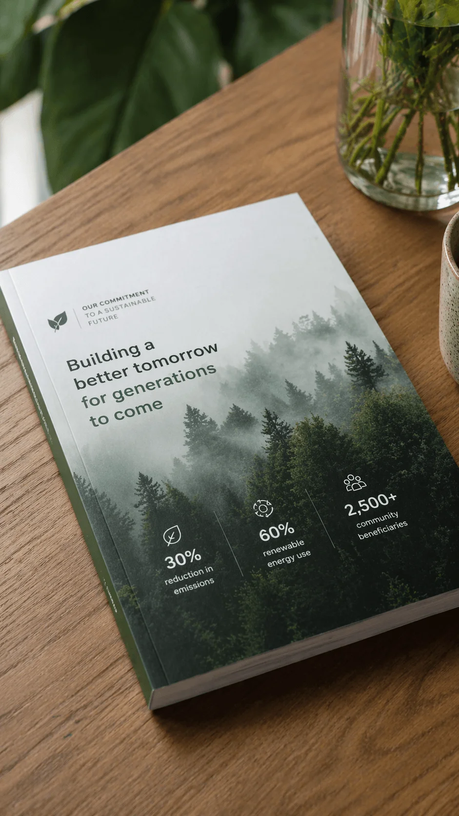
At the same time, this trend requires careful balance. The design must remain professional and clear while still conveying a sense of purpose. When executed effectively, it enhances both the aesthetic and the meaning of the report.
Aligning Multiple Reporting Frameworks Through Design
Organizations are required to follow multiple reporting frameworks, which can make sustainability reporting complex. Design is playing an important role in simplifying this complexity.
Visual systems are being developed to show how different frameworks relate to each other. This helps users understand how data aligns across various standards.
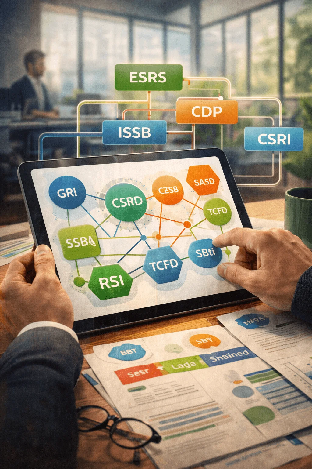
By making these relationships clear, reports become more transparent and easier to navigate. This is particularly important for stakeholders who need to compare information across different organizations.
Building Trust Through Verification and Clarity
Trust is one of the most important outcomes of sustainability reporting. Design contributes to this by making verification and assurance visible.
Clear presentation of audited data, consistent formatting, and transparent sourcing all help build confidence. Readers are more likely to trust information that is presented in a structured and coherent way.

Design also supports trust by reducing ambiguity. When information is easy to understand and interpret, it becomes more credible. This is especially important in a field where accuracy and accountability are critical.
Personalization and User Focused Design
Personalization is becoming a defining feature of modern sustainability reports. Different users have different needs, and design must accommodate this diversity.
User focused design allows readers to access the information that is most relevant to them. This can be achieved through interactive features, tailored navigation, and adaptable content structures.
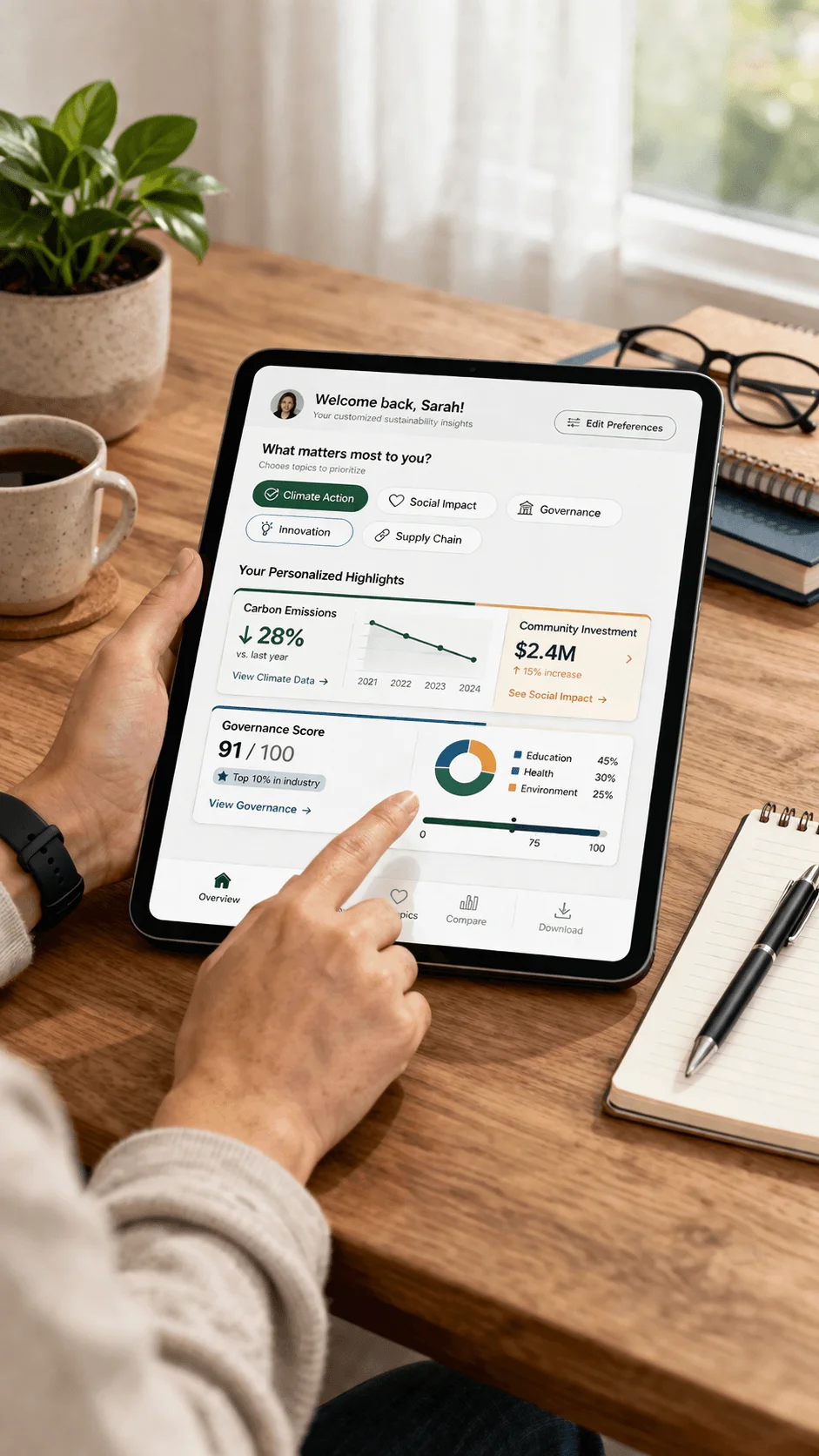
This approach not only improves usability but also increases engagement. When users feel that the report is designed for them, they are more likely to explore it in depth.
Conclusion
The sustainability report design landscape 2026 represents a profound shift in how organizations communicate their impact. Reports are evolving from static documents into dynamic, user centered experiences that combine design, technology, and storytelling.
This transformation reflects the growing importance of sustainability in business strategy and the increasing expectations of stakeholders. Design is no longer just about presentation. It is about creating clarity, building trust, and enabling understanding.
Organizations that embrace this new approach will be better equipped to communicate their value and demonstrate their commitment to sustainability. As the landscape continues to evolve, the role of design will only become more important, shaping the future of how sustainability is understood and acted upon.