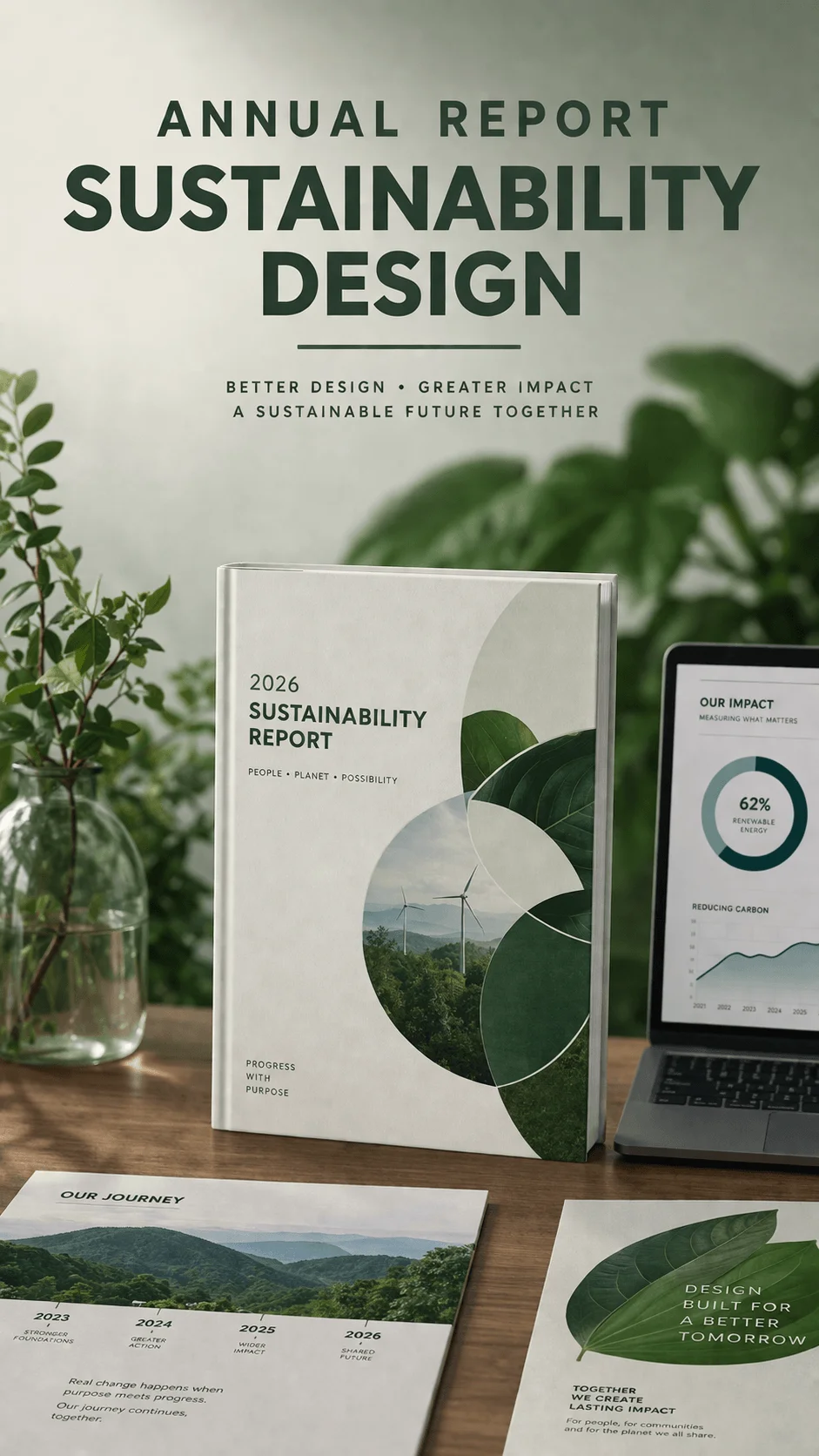
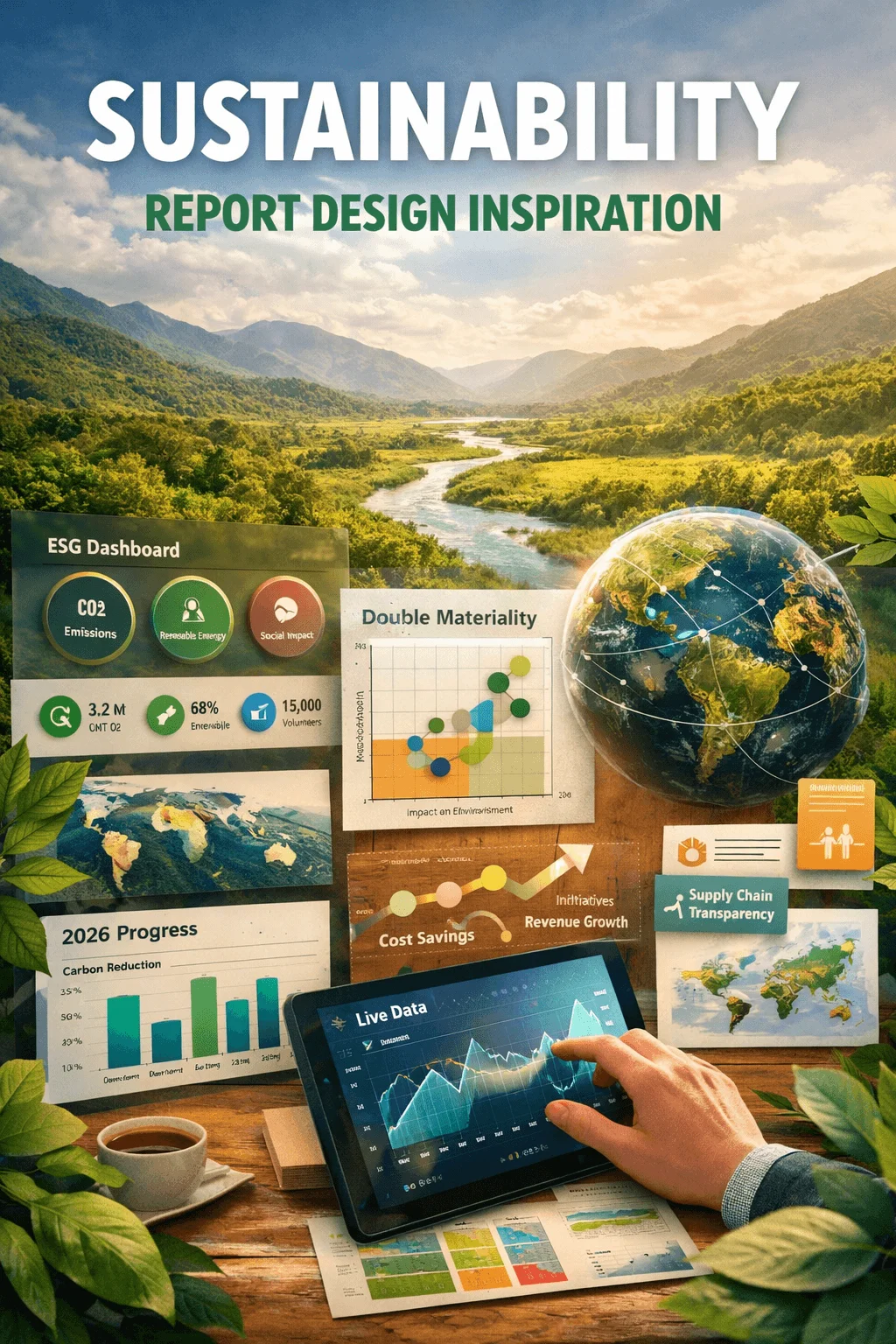
Sustainability Report Design Inspiration 2026
Sustainability reports have gone through a significant transformation. What used to be static documents created mainly for compliance has now become a powerful communication tool that reflects a company’s vision, responsibility, and long term strategy. In 2026, the role of design in sustainability reporting is no longer secondary. It shapes how information is perceived, how trust is built, and how effectively a message is delivered.
Today’s readers do not want to read long blocks of data. They expect clarity, engagement, and meaningful storytelling. This shift has pushed designers to rethink how sustainability reports are structured and experienced. The focus is no longer just on presenting information but on creating an intuitive and visually compelling journey.
Interactive Scroll Based Storytelling
Interactive storytelling has redefined how sustainability reports are consumed. Instead of presenting all information at once, content unfolds gradually as the user scrolls. This creates a sense of progression and keeps the reader engaged throughout the experience.
This approach allows designers to guide attention and control how information is revealed. Complex topics can be broken down into smaller sections, making them easier to understand. Visual transitions and layered content help create a narrative flow that feels natural and intuitive.
Interactive storytelling also allows for emotional connection. When users move through a report step by step, they experience the story rather than just reading it. This makes the content more memorable and impactful.
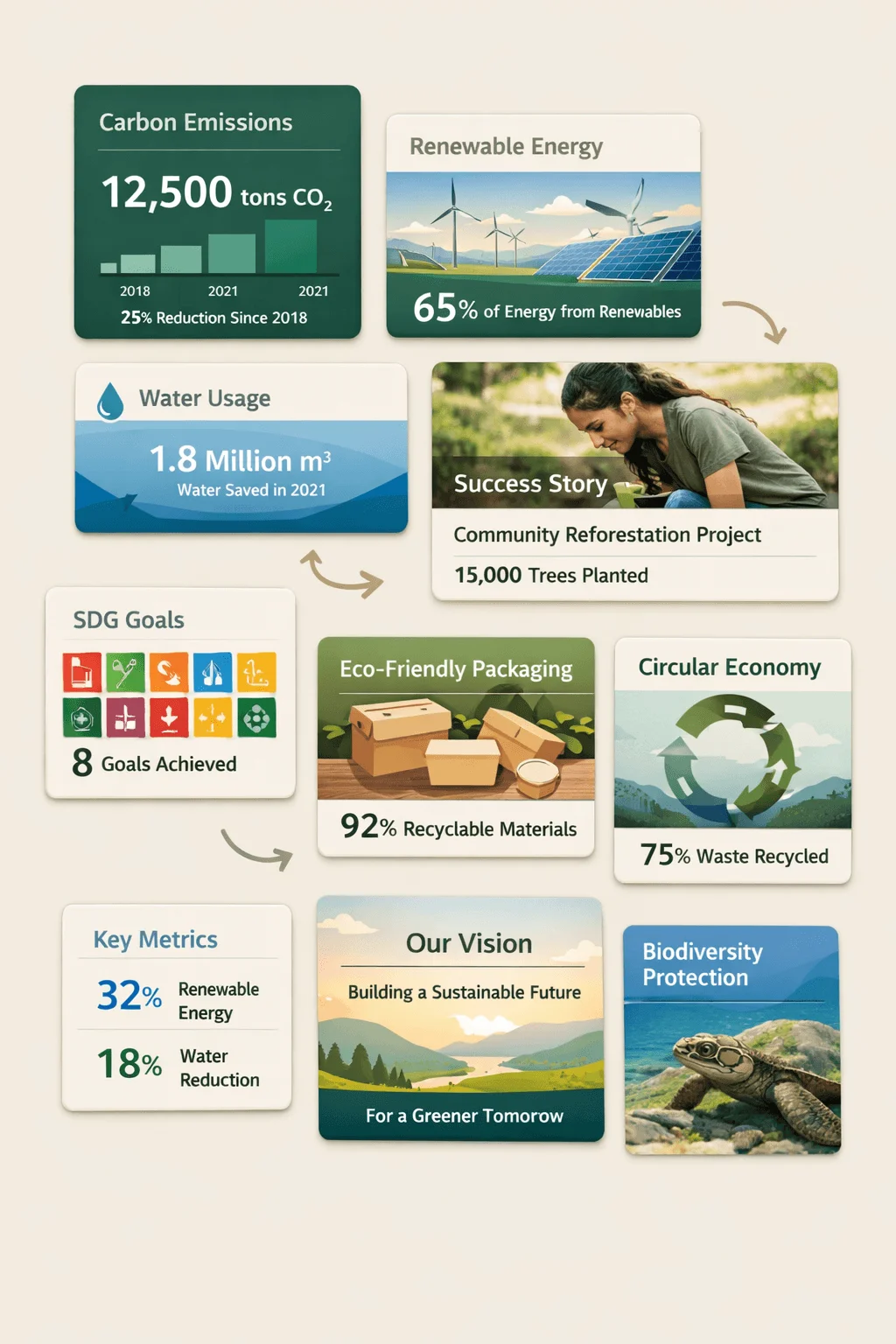
ESG Dashboard Layouts
Dashboard inspired layouts bring a sense of structure and clarity to sustainability reporting. Instead of long pages filled with text, key metrics are presented in clearly defined sections that resemble digital dashboards.
This design approach reflects how people consume information today. Users are familiar with dashboards from apps and digital platforms, so the format feels intuitive. Important data such as emissions, energy use, and social impact can be understood at a glance.
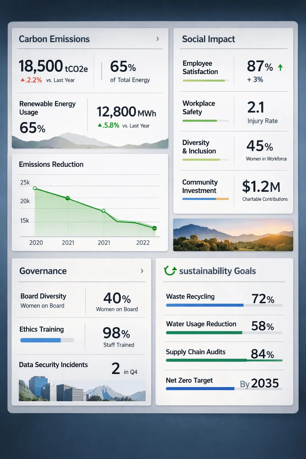
Beyond clarity, dashboard layouts also create a sense of transparency. By presenting key indicators upfront, companies show confidence in their data and make it easier for stakeholders to evaluate performance.
AI Generated Data Visualizations
Artificial intelligence is beginning to influence how data is presented in sustainability reports. Instead of manually designing every chart, AI tools can analyze datasets and generate visualizations that highlight patterns and insights.
This shift changes the role of the designer from creator to curator. Designers focus on refining and contextualizing visuals rather than building them from scratch. The result is faster production and more accurate representation of data.
AI generated visuals also open the door to dynamic reporting. Charts can adapt based on user interaction or updated data, making the report more responsive and relevant.
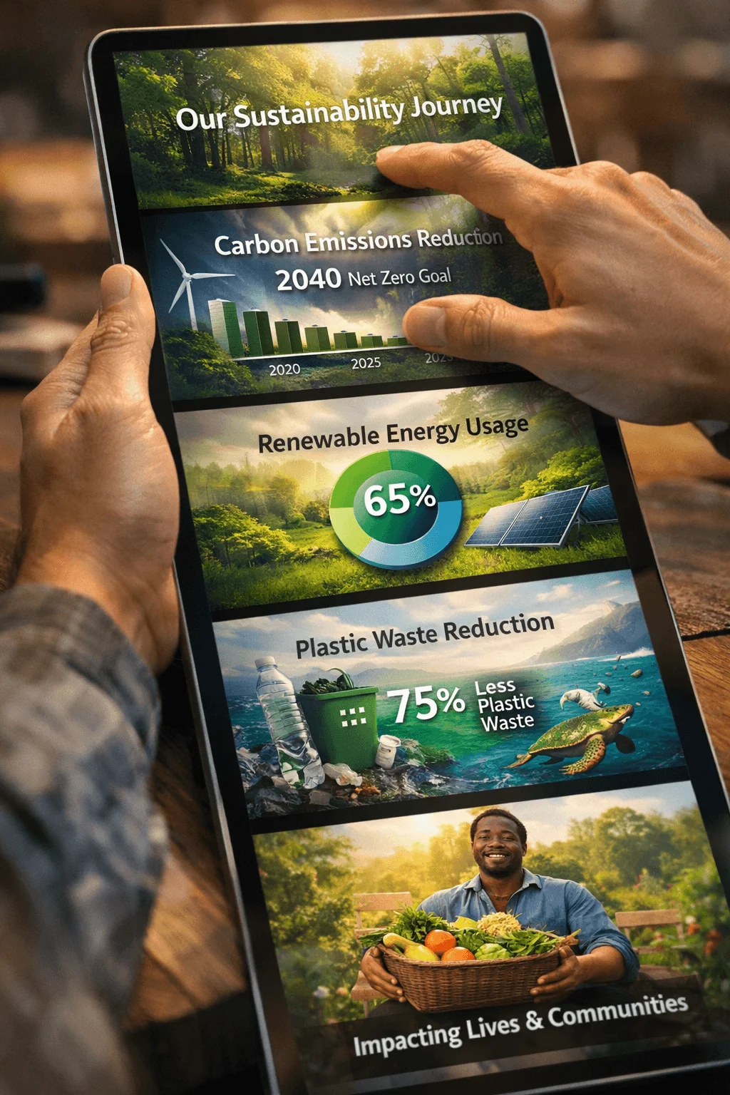
Modular Card Based Layouts
Modular design introduces flexibility into sustainability reports by breaking content into smaller independent sections. Each module represents a specific idea, metric, or story, allowing readers to focus on one piece of information at a time.
This approach improves readability by reducing visual clutter. Instead of long continuous sections, content is organized into structured blocks that are easier to scan. It also allows designers to rearrange content without disrupting the overall layout.
Modular systems are especially useful for multi platform reports. The same content can be adapted for web, mobile, or print formats without major redesign.
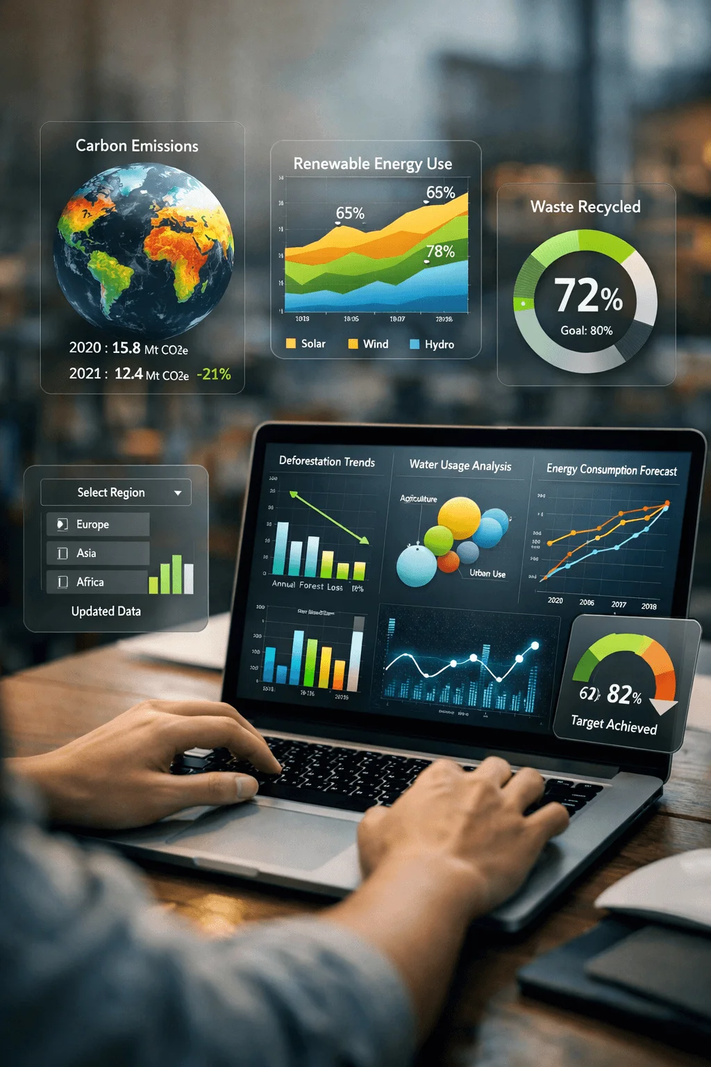
Real Time Data Reporting
Real time reporting is becoming a defining feature of modern sustainability communication. Instead of presenting outdated information, companies are moving toward live data that reflects current performance.
This approach builds trust because it shows transparency and accountability. Stakeholders can see how a company is performing in real time rather than relying on past data.
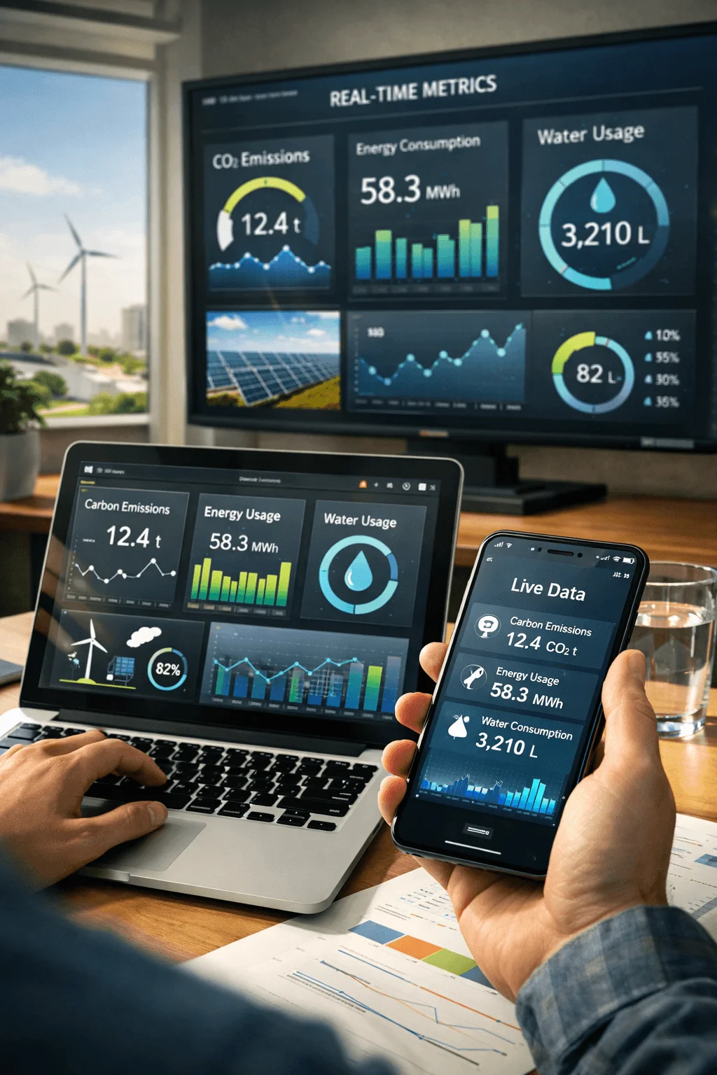
From a design perspective, real time reporting requires a shift toward digital platforms. Designers must create interfaces that can handle continuous updates while maintaining clarity and usability.
Nature Centric Visual Design
Nature inspired design has become a dominant aesthetic in sustainability reporting. Organic shapes, natural textures, and earthy color palettes are used to visually reinforce environmental themes.
This design style goes beyond decoration. It creates a visual language that aligns with the message of sustainability. Soft gradients, fluid layouts, and nature imagery help create a sense of authenticity and connection.

When used thoughtfully, nature centric design can make a report feel more human and relatable. It bridges the gap between data and emotion, making the content more engaging.
Supply Chain Transparency Maps
Transparency is one of the most important aspects of sustainability reporting, and supply chain visualization plays a key role in achieving it. Companies are increasingly using maps and diagrams to show where materials come from and how products are made.
These visualizations turn complex supply chains into clear and understandable narratives. They help readers see the journey of a product and understand the impact at each stage.
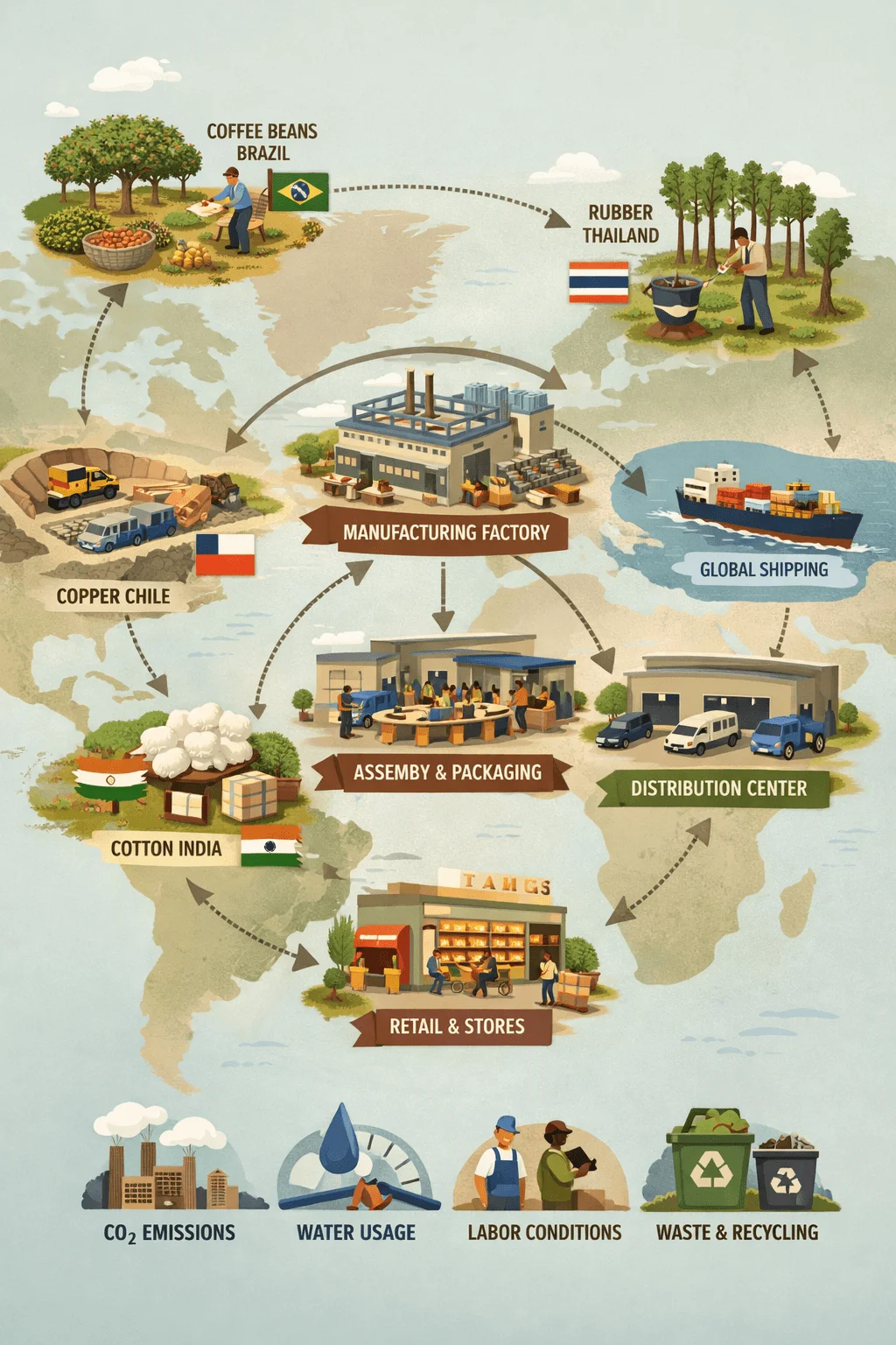
Designing these maps requires careful balance. The goal is to simplify without oversimplifying, ensuring that the information remains accurate while being easy to follow.
Data Storytelling Over Data Dumping
One of the biggest changes in sustainability report design is the shift from data heavy layouts to story driven communication. Instead of overwhelming readers with numbers, reports now focus on what the data actually means.
This approach requires designers to think like storytellers. Each visual and piece of content should contribute to a larger narrative. Charts are no longer standalone elements but part of a cohesive story.
By focusing on insights rather than raw data, reports become more engaging and easier to understand. This also helps readers connect the information to real world impact.
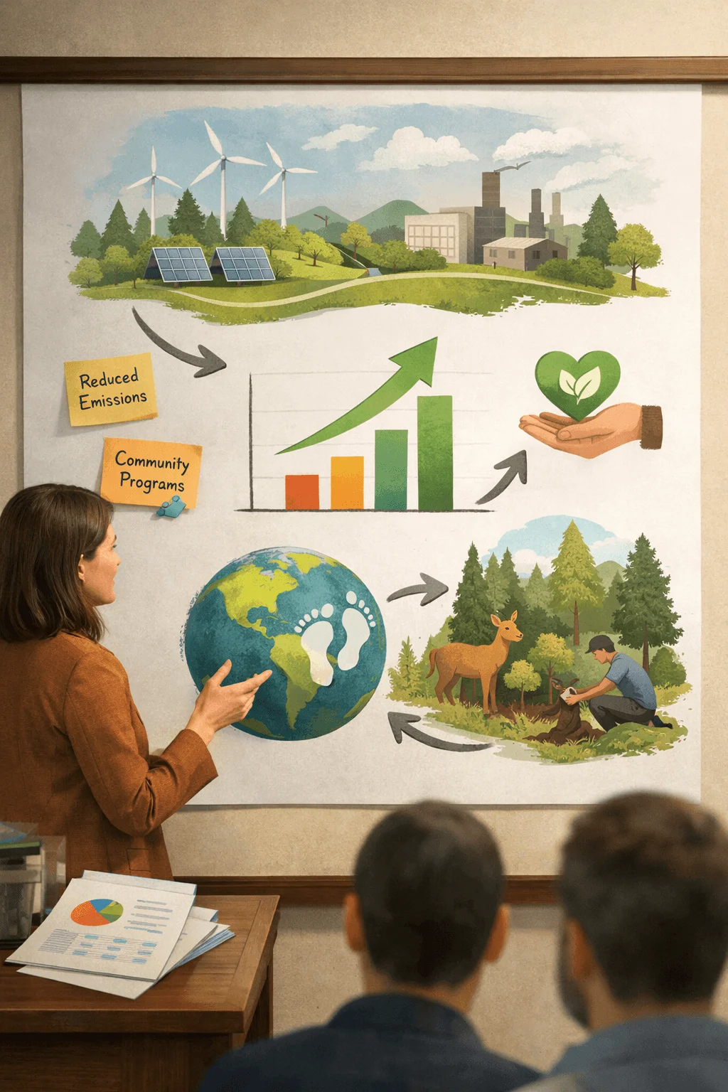
Impact and Business Value Visualization
Sustainability is no longer seen as separate from business performance. Reports now aim to show how environmental and social initiatives contribute to financial success.
This requires a new type of visualization that connects impact with value. Designers create visuals that show relationships between sustainability efforts and outcomes such as cost savings, efficiency, or growth.

These visuals help shift the perception of sustainability from a responsibility to an opportunity. They demonstrate that sustainable practices can drive business success.
Multi Format Report Systems
Modern sustainability reports are designed to exist across multiple platforms. A single report may be presented as a website, a downloadable document, and a series of social media assets.
This requires a flexible design system that can adapt to different formats while maintaining consistency. Designers must think beyond a single layout and create systems that work in various contexts.

Multi format design also increases reach. By making content accessible in different ways, companies can engage a wider audience.
Micro Animations and Motion Design
Motion has become an important element in digital report design. Subtle animations guide attention, highlight changes, and make interactions feel more natural.
These animations are not meant to distract but to enhance understanding. For example, animated charts can show trends over time more effectively than static images.

When used carefully, motion design adds a layer of sophistication and improves user experience. It makes reports feel modern and interactive.
Double Materiality Visualization
Double materiality is becoming a key concept in sustainability reporting. It focuses on understanding both the impact of a company on the environment and the impact of environmental factors on the company.
Visualizing this concept requires thoughtful design. Designers often use matrices or layered visuals to show the relationship between different factors.
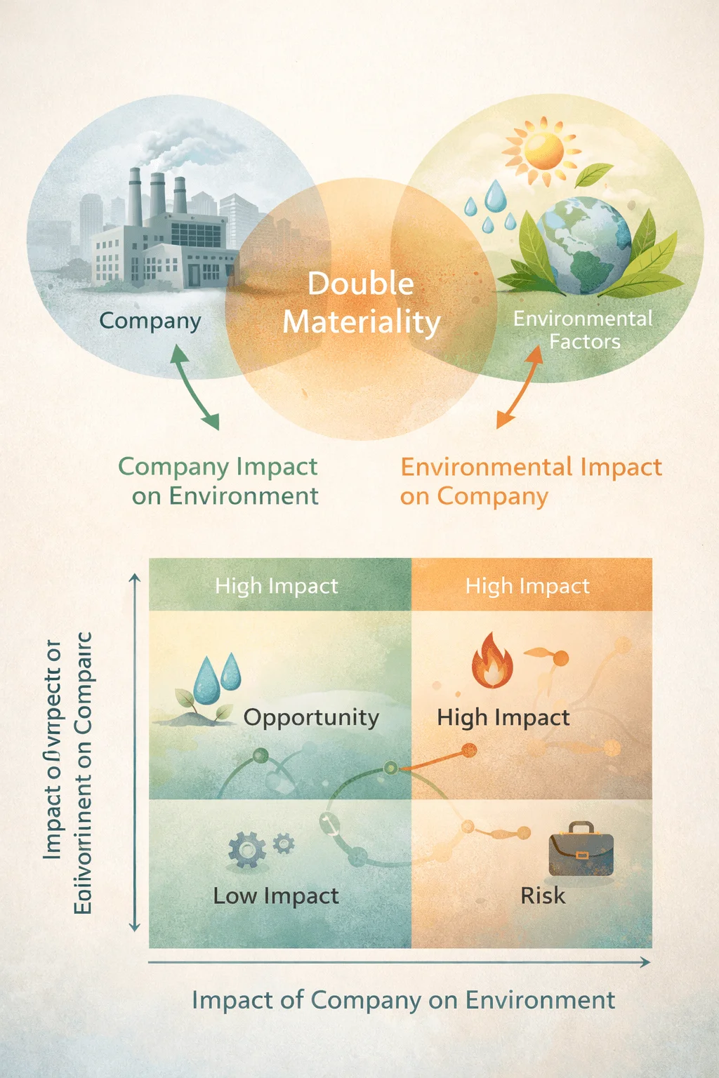
This approach helps readers understand the complexity of sustainability. It provides a more complete picture of risk and opportunity.
Minimal and Story First Layouts
Minimal design continues to be a strong trend, but in 2026 it is combined with a strong focus on storytelling. The goal is not just to simplify visuals but to create a clear narrative structure.
Whitespace, typography, and hierarchy are used to guide the reader through the content. Each section has a clear purpose, and unnecessary elements are removed.
This approach improves readability and ensures that key messages stand out. It also creates a more refined and professional look.
Integrated Annual and ESG Reports
The separation between financial reporting and sustainability reporting is gradually disappearing. Companies are integrating both into a single unified report.
This reflects a shift in thinking where sustainability is seen as part of core business strategy. Design plays a crucial role in merging these two areas into a cohesive structure.

Integrated reports require careful organization to balance different types of information. The goal is to create a seamless experience where financial and sustainability data complement each other.
AI Powered Personalized Reports
Personalization is emerging as a new frontier in sustainability reporting. Instead of presenting the same content to everyone, reports can adapt based on user preferences.
Different stakeholders have different needs. Investors may focus on financial impact, while customers may care more about environmental initiatives. Personalized reports allow each user to access relevant information easily.
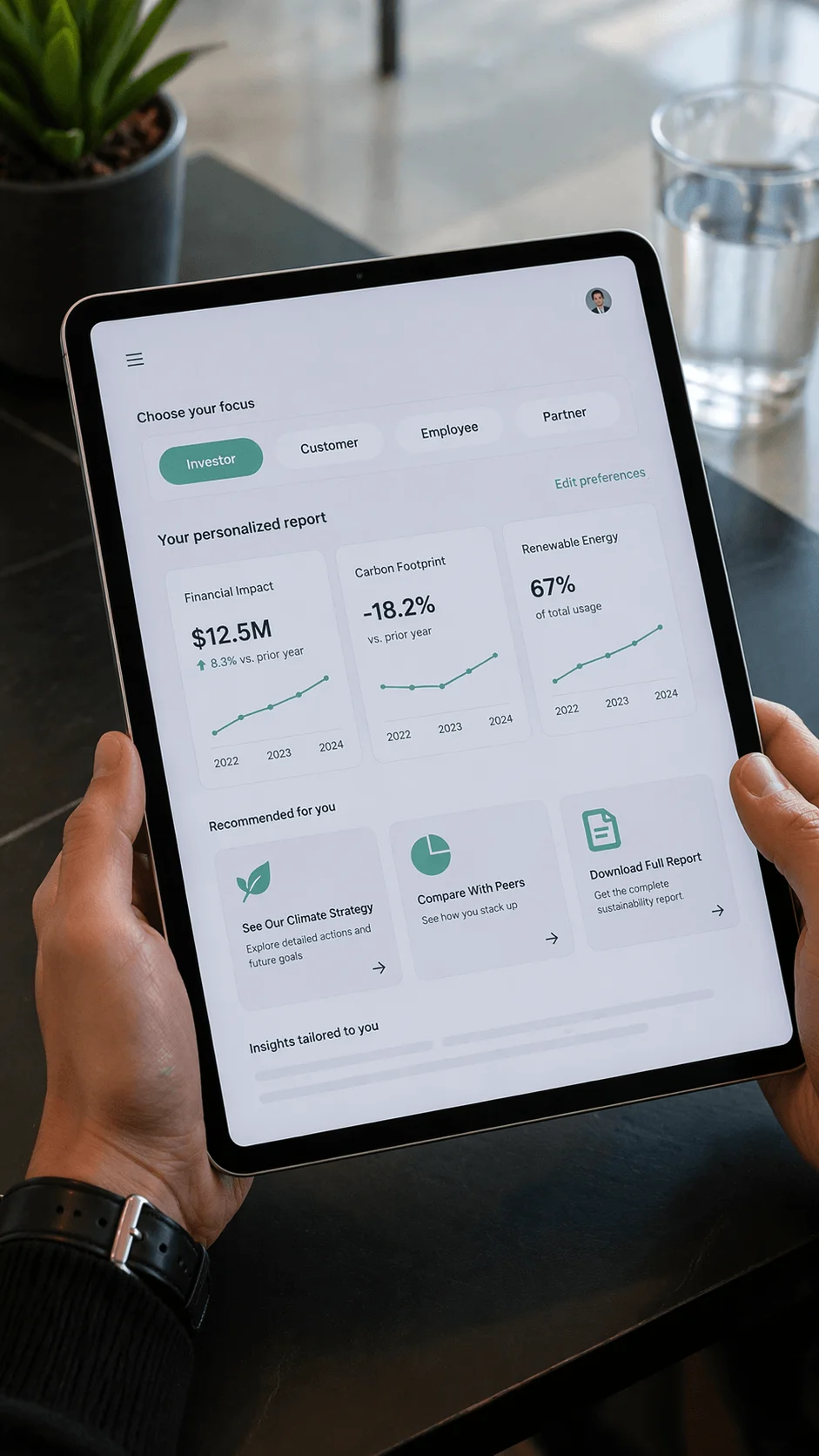
Designing for personalization requires flexible systems and interactive interfaces. It represents a shift toward user centered reporting.
Conclusion
Sustainability report design in 2026 is defined by transformation. Reports are no longer static documents but dynamic experiences that combine design, data, and storytelling. The focus has shifted toward clarity, engagement, and meaningful communication.
The ideas explored in this article highlight how design is evolving to meet new expectations. From interactive storytelling to real time data and personalized experiences, each trend reflects a deeper change in how organizations communicate their impact.
As sustainability continues to grow in importance, the role of design will become even more critical. Designers who embrace these modern approaches will not only create better reports but also contribute to shaping how sustainability is understood and valued in the future.