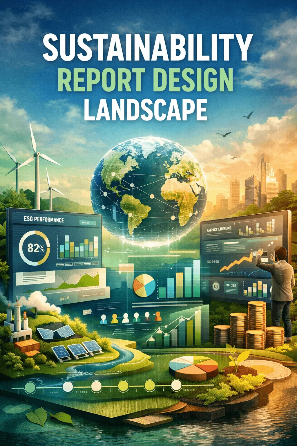
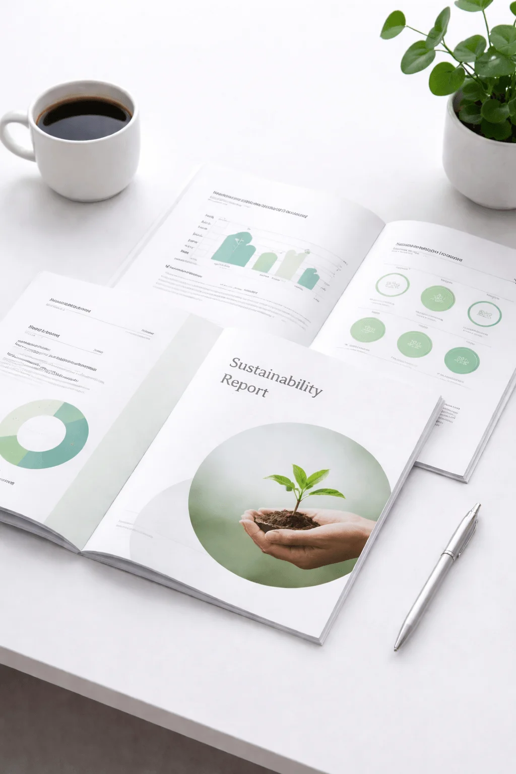
Best Sustainability Report Layout Ideas for Designers
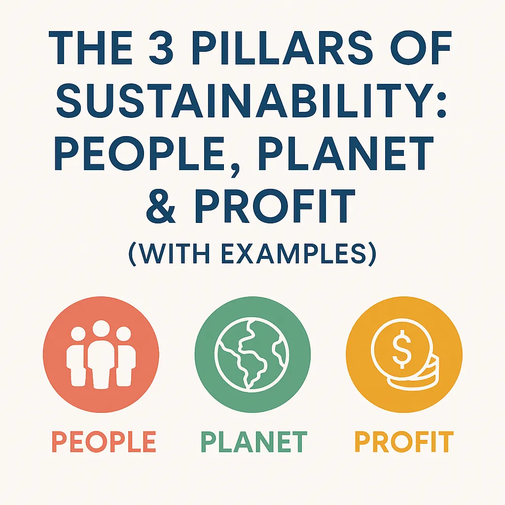
Sustainability reporting has transformed into a central communication tool that reflects how organizations think, act, and position themselves in a rapidly changing world. In 2026, the sustainability report design layout is no longer treated as a formal document created for compliance. It is now a carefully designed experience that blends strategy, storytelling, and visual intelligence.
Designers are no longer just arranging content. They are shaping how information is perceived, understood, and remembered. The shift from static documents to interactive and user focused formats has changed the expectations completely. Readers now demand clarity, speed, and engagement. This evolution has made layout design one of the most important elements in sustainability communication.
Interactive Digital Report Layouts
The transition from static documents to interactive experiences is one of the most defining changes in 2026. Reports are now designed as digital journeys where users can explore content at their own pace. This approach changes the role of layout from a fixed structure to a dynamic system.
Interactive layouts allow designers to control the flow of information through scrolling experiences, transitions, and layered content. Instead of overwhelming the reader with everything at once, information is revealed progressively. This creates a sense of engagement and encourages deeper exploration.
Data Visualization as a Core Language
Data visualization has moved from being a supporting element to becoming a central design language. In modern sustainability report design layout, visuals are not just decorative. They are the primary way information is communicated.
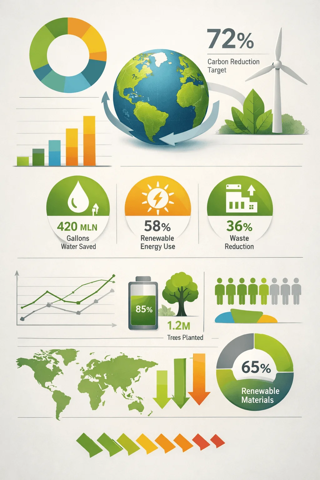
Charts, diagrams, and visual indicators transform abstract numbers into meaningful insights. Designers are now focusing on clarity and simplicity rather than complexity. The goal is not to show how much data exists, but to highlight what truly matters.
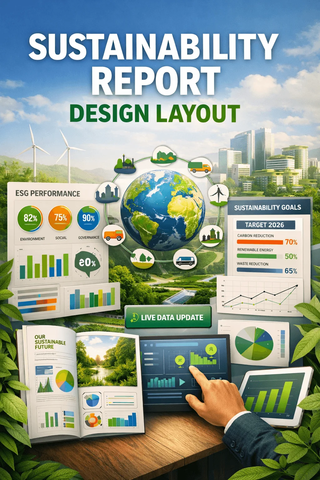
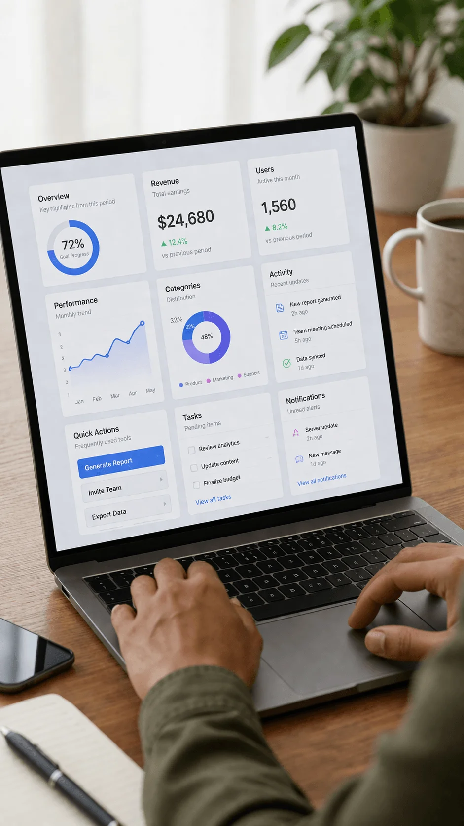
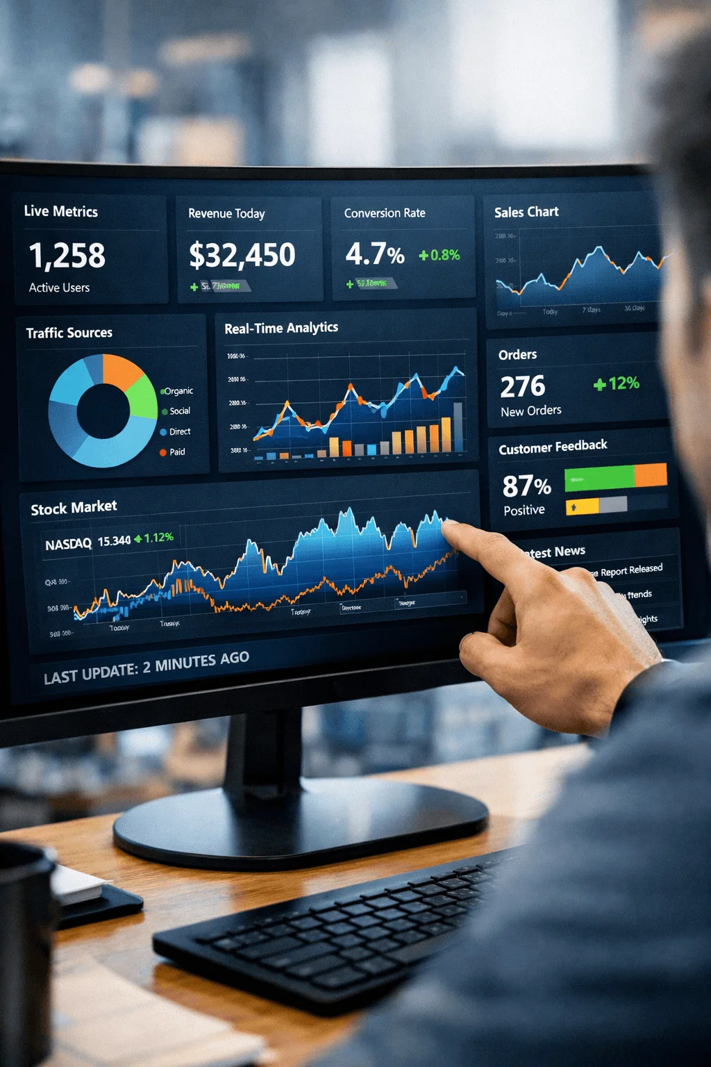
ESG Dashboard Style Layouts
Dashboard inspired layouts bring a sense of structure and immediacy to sustainability reports. They allow readers to access key metrics quickly and understand performance at a glance.
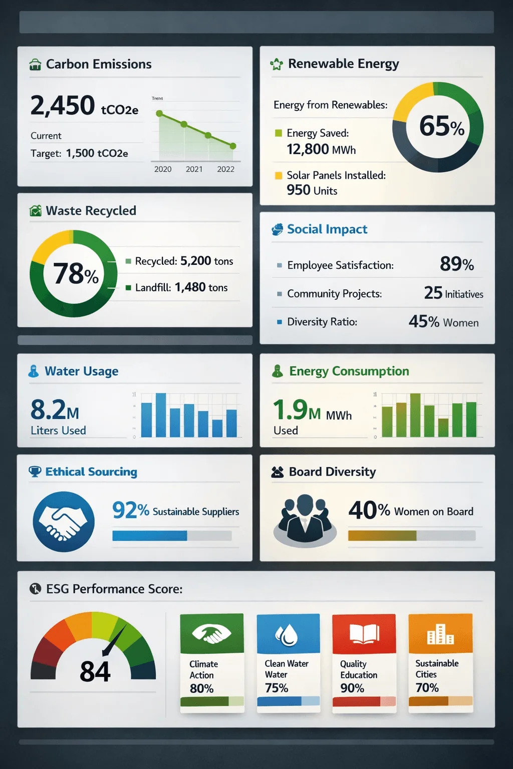
This approach reflects the influence of digital interfaces, where users expect real time clarity and intuitive navigation. By organizing information into clearly defined sections, dashboard layouts create a sense of control and transparency.
Modular and Card Based Design
Modular design introduces flexibility into the layout. Instead of long continuous sections, content is divided into smaller units that can stand on their own. Each module carries a specific piece of information and can be rearranged without disrupting the overall structure.
This approach makes reports more adaptable to different formats and devices. It also improves readability by breaking down complex information into manageable pieces.
Integrated Print and Digital Systems
In 2026, sustainability reports are no longer limited to a single format. They exist across multiple platforms, and the layout must reflect this reality. Designers are now creating systems that work seamlessly in both print and digital environments.
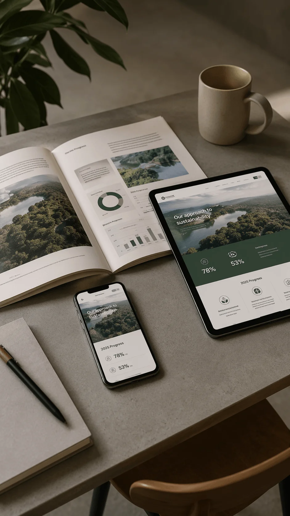
This requires a shift from page based thinking to system based thinking. The focus is on creating consistent visual elements that can adapt to different contexts while maintaining a unified identity.
Storytelling and Data Integration
The most effective reports combine narrative depth with analytical precision. Storytelling provides context, while data supports credibility. The layout plays a crucial role in connecting these two elements.
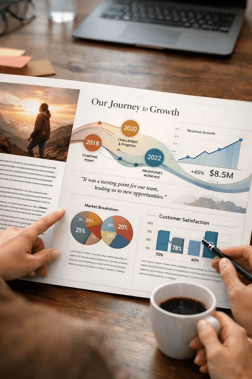
Designers are exploring ways to weave stories into data sections, creating a continuous flow of information. This approach makes the report more engaging and helps readers connect emotionally with the content.
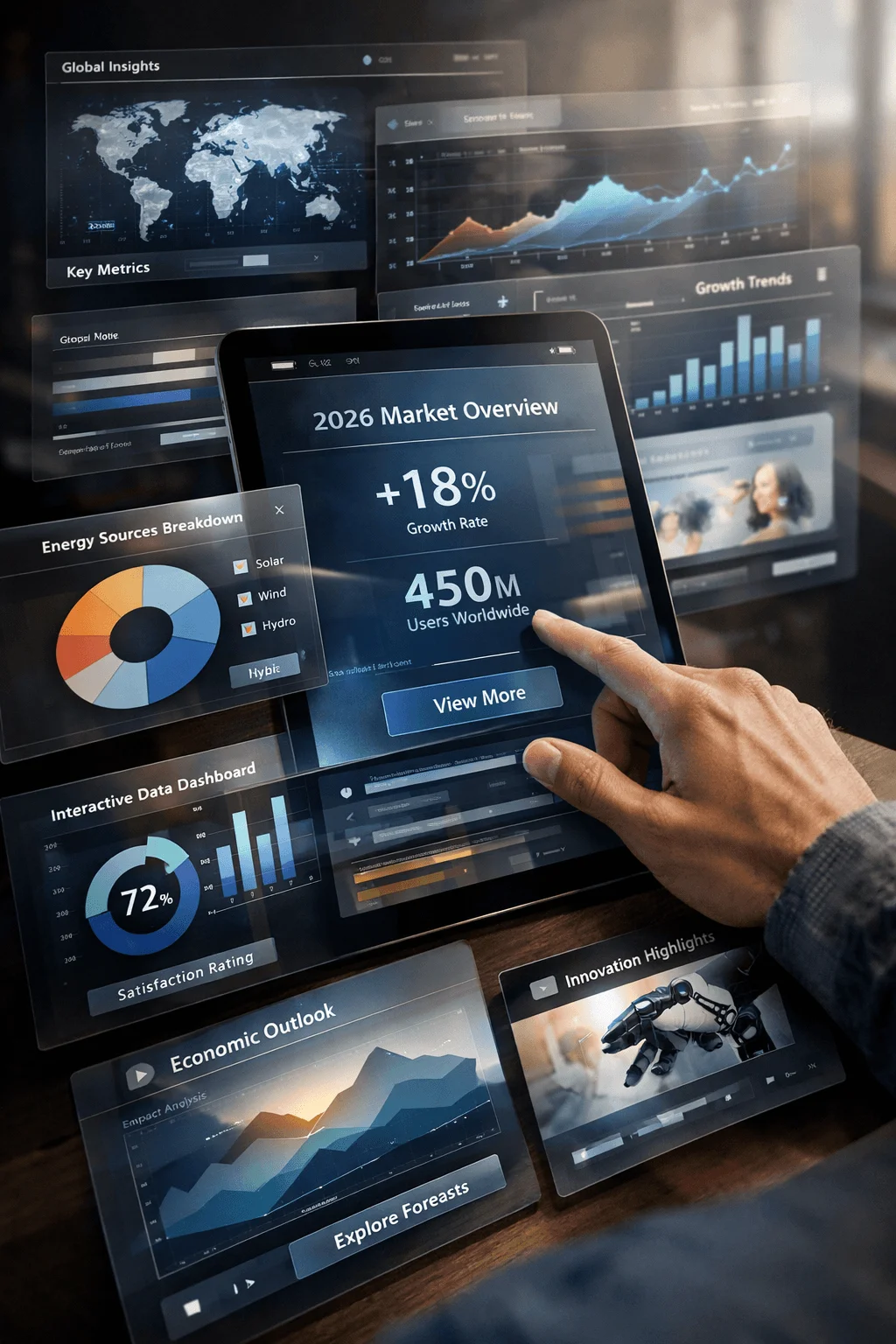
Real Time and Dynamic Data Sections
The idea of static reporting is gradually fading. Organizations are moving toward real time data presentation, especially in digital formats. This shift changes how layouts are structured.
Dynamic sections allow information to be updated without redesigning the entire report. This creates a living document that evolves over time. It also increases transparency and trust, as stakeholders can access the latest data.
Business Value Focused Layouts
Sustainability is increasingly being viewed through the lens of business impact. Reports now emphasize how sustainable practices contribute to financial performance and long term growth.

Layout design reflects this shift by highlighting key outcomes such as cost savings, efficiency improvements, and risk reduction. This approach makes the report more relevant to decision makers.
Supply Chain Transparency Visuals
Transparency has become a central theme in sustainability reporting. Designers are using visual tools to map out supply chains and show how materials and processes are connected.
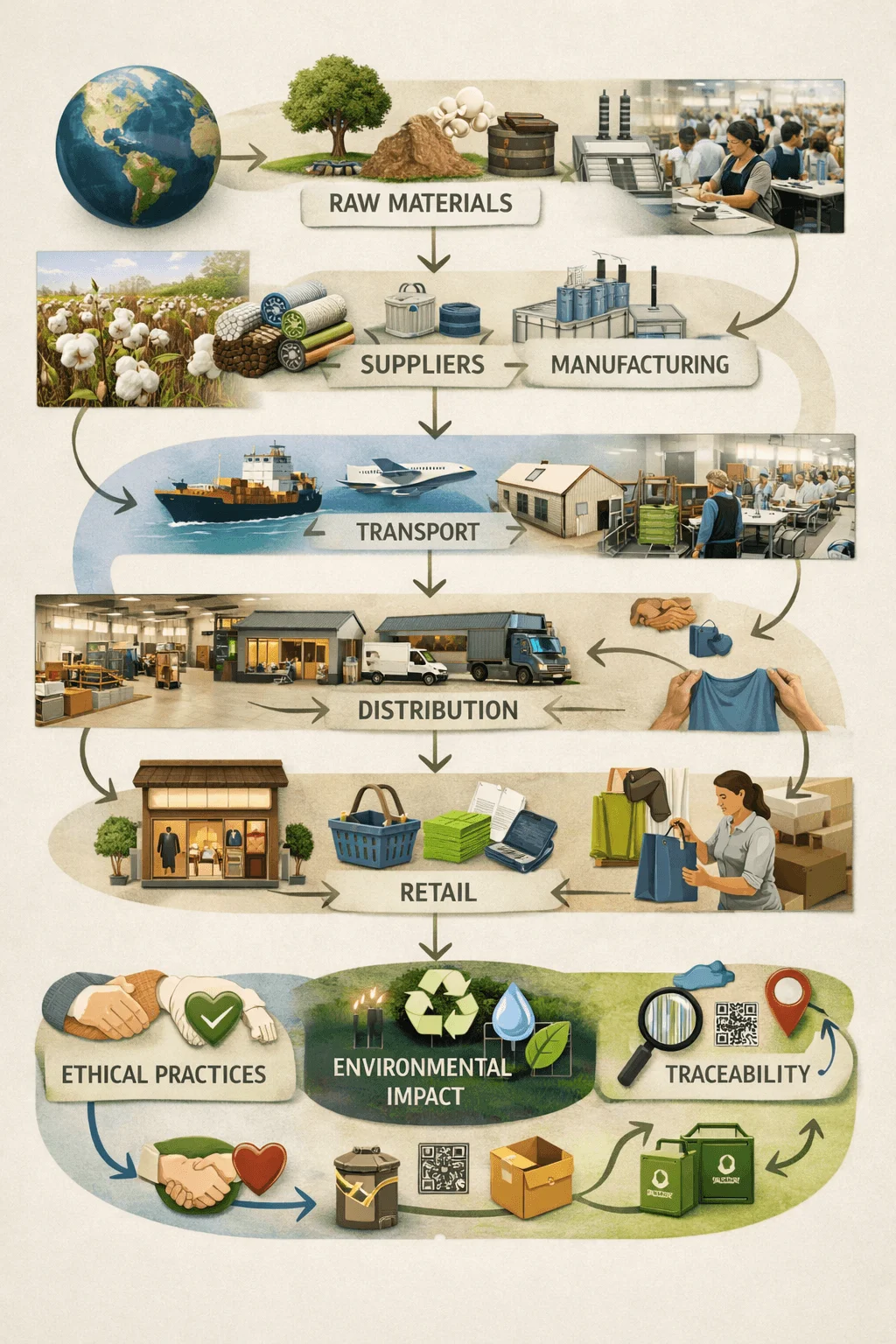
These visuals help readers understand complex systems in a simple way. They also reinforce the organization’s commitment to openness and accountability.
Minimal and Clean Layouts
Minimalism continues to shape modern design. In sustainability reporting, a clean layout allows the content to stand out without distractions.
This approach focuses on clarity, simplicity, and intentional use of space. By removing unnecessary elements, designers create a more focused and impactful experience.
Nature Inspired Visual Identity
Visual identity plays a significant role in reinforcing the message of sustainability. Designers are drawing inspiration from natural forms, colors, and textures to create a sense of authenticity.

This approach goes beyond aesthetics. It creates a visual connection between the content and the values it represents.
Goal Tracking and Scorecards
Tracking progress is essential in sustainability reporting. Designers are creating clear and engaging ways to show how goals are being achieved.
Scorecards and visual indicators provide a quick overview of performance. They also make it easier for readers to compare targets and results.
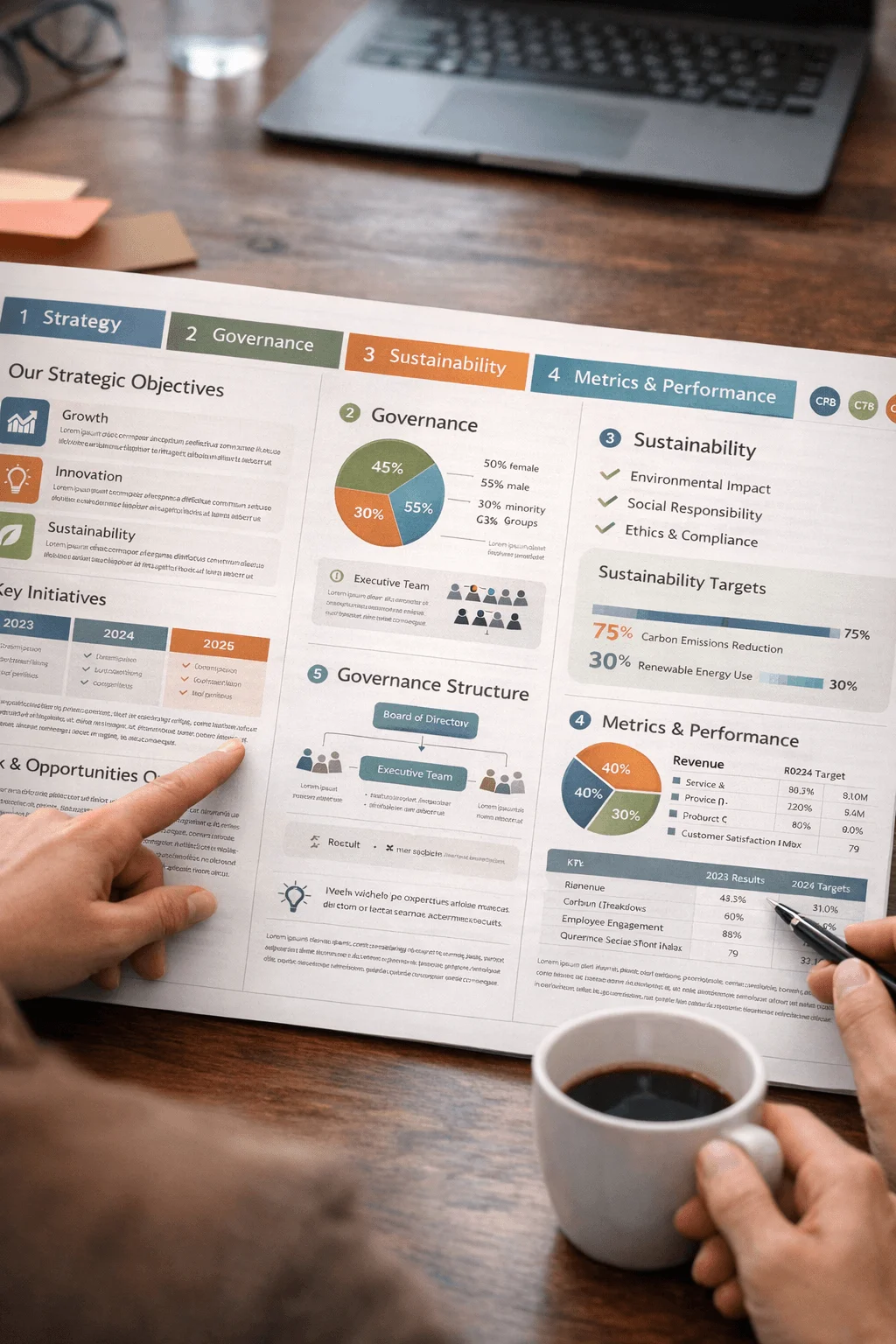
Framework Aligned Layouts
Global reporting standards have become more important than ever. Layouts are now structured to align with these frameworks, ensuring clarity and consistency.
This approach helps readers navigate the report more easily and understand how information is organized.
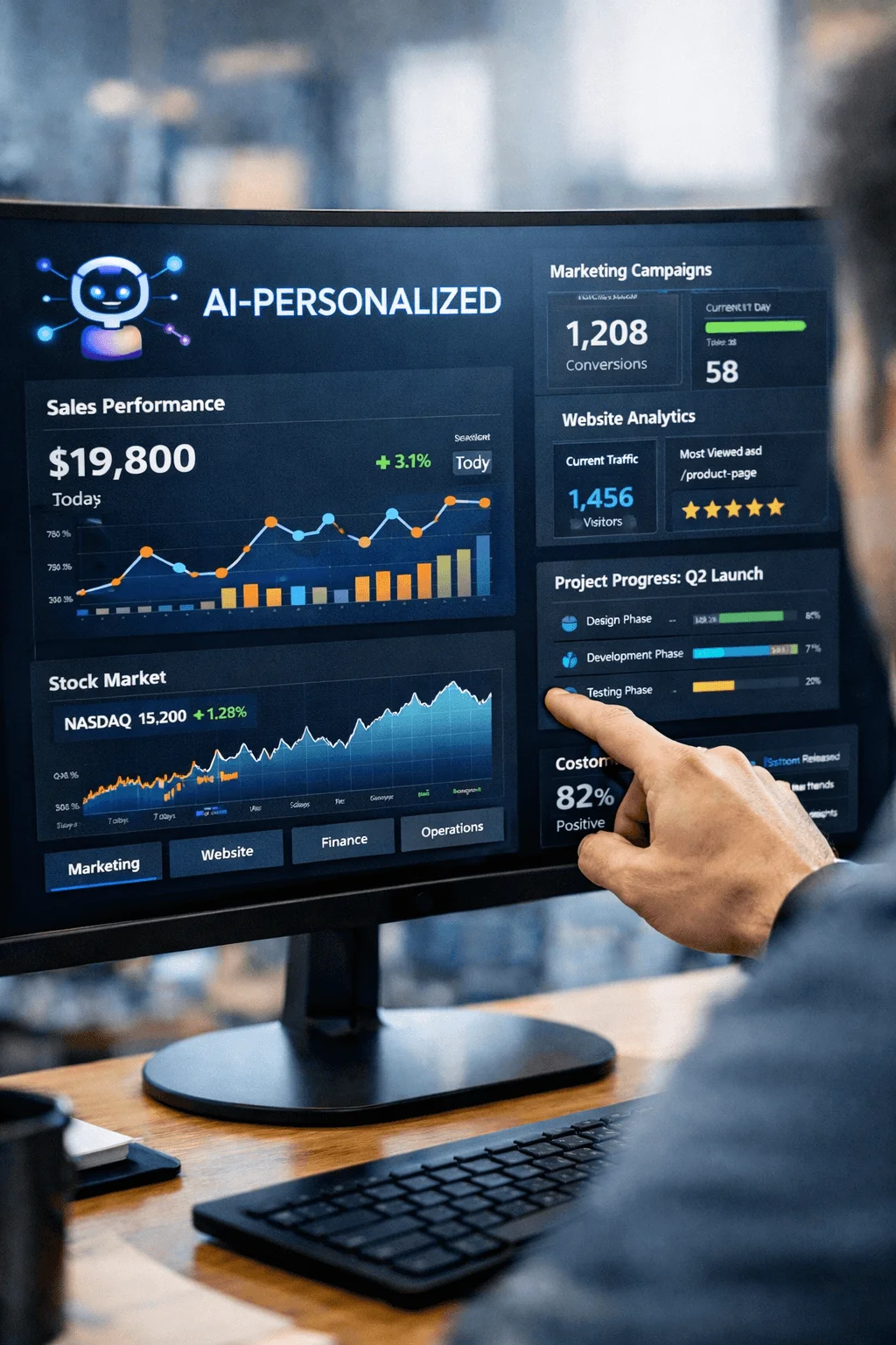
AI Assisted Personalization
Artificial intelligence is beginning to influence how reports are experienced. Personalized layouts allow users to focus on the information that matters most to them.
This creates a more relevant and engaging experience, especially for diverse audiences with different priorities.
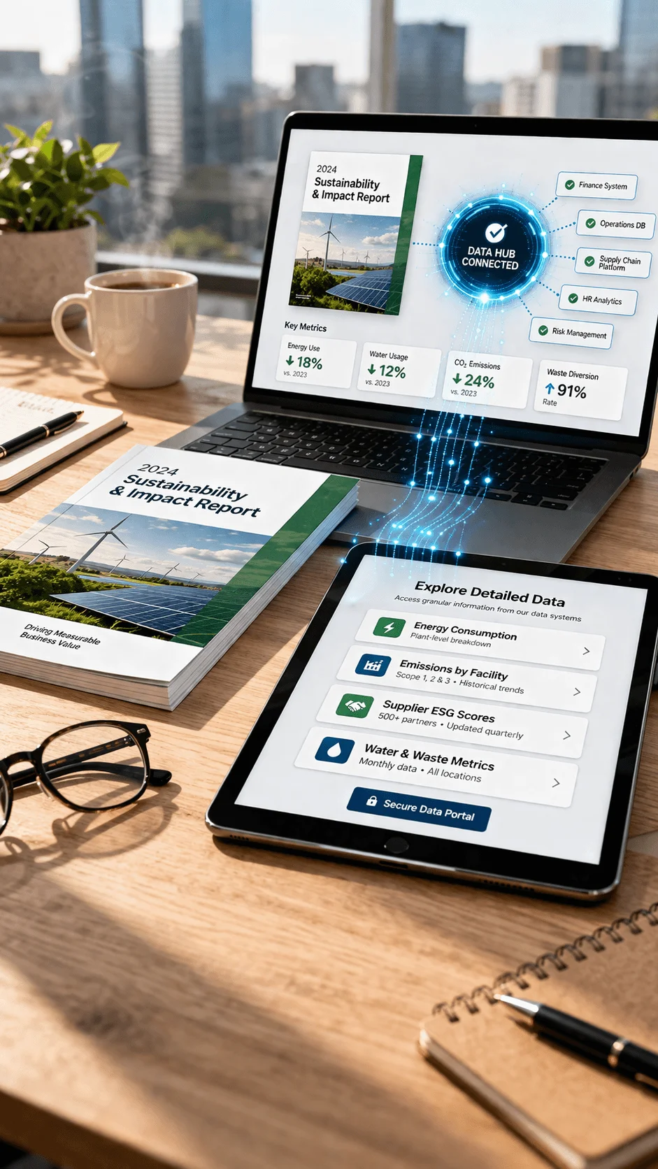
Centralized Data Hub Concept
The idea of a single source of truth is becoming more common. Reports are now connected to centralized data systems that provide deeper insights.
This approach allows the main report to remain clear and focused, while detailed data is accessible through additional layers.
Conclusion
Sustainability report design in 2026 represents a shift from static communication to meaningful experience design. It is no longer enough to present information clearly. Designers must create layouts that engage, inform, and inspire.
By embracing modern approaches such as interactive design, modular systems, and data driven storytelling, it is possible to transform complex information into compelling narratives. A well designed sustainability report does more than communicate performance. It builds credibility, strengthens identity, and creates lasting impact.